You Should View SP500 Rally With Caution | Episode 127
Where is the Stock Market Heading?
00:00 Intro
00:30 This is what I like about the SP500
05:03 Is this a basing formation in the Nasdaq?
05:28 Look at this classic pattern in the Dow
06:10 These 2 key stocks are breaking higher
07:58 But this worries me (very important)
10:11 Watch this closely – something has to give
Transcript
Please note: Charts available from video
This video is going to focus on the S&P 500. We’re going to have a look at the ASX 200, gold, and uranium in a separate video. You can watch that video here. I’m also going to have a look at two areas of particular concern that I have with the current markets. Make sure you stick around for that. As always, this is general commentary. It doesn’t take your personal situation into account. With all of that said, let’s get into our first chart.
So, we’re going to start with the S&P 500. And the first thing I want to do, I want to look at some of the positives to the current market structure, and then I’m going to go and have a look at some of those points that are worrying me. So, I’m going to get to that in a moment. But first of all, let’s have a look at what happened last week.
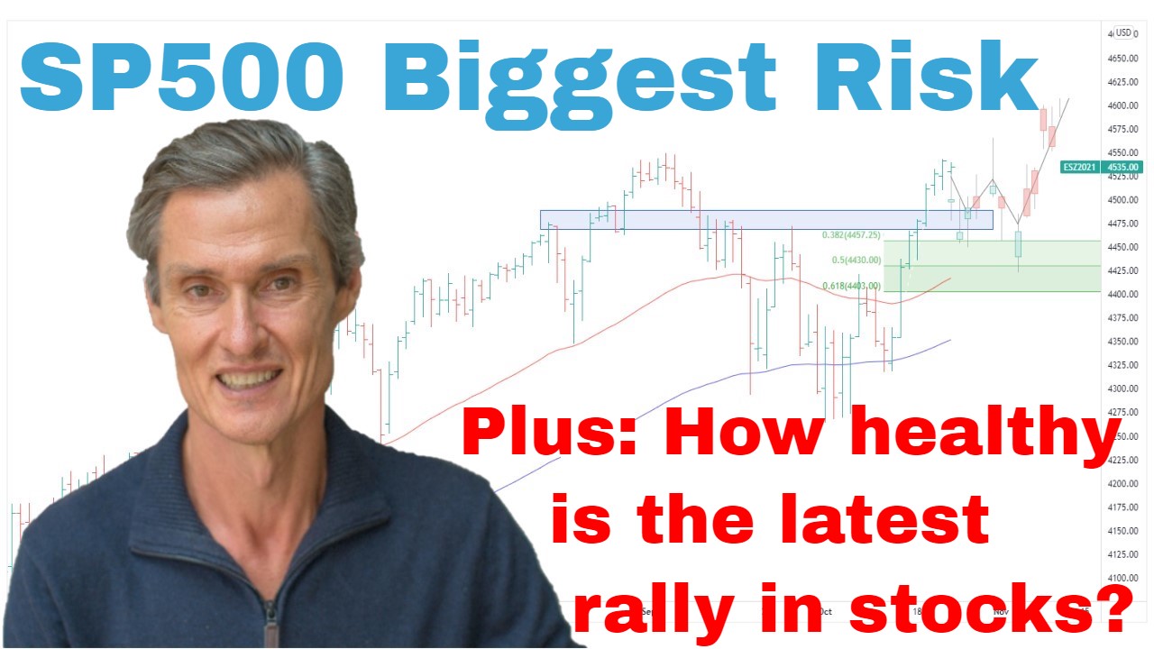
So, last week, in last week’s video, the focus was on this resistance area at around 4200, key resistance area, which goes back to around June last year. And the thoughts were that we’d had a decent rally off this March low. And quite often when you get that strength off a low, you get a good rally, you need to have a pause. And we’re right beneath resistance. And that’s, of course, what we’ve had in the last few days. We’ve had a pause, we’ve had a pullback, and pullback over Wednesday and Thursday actually picked up a little bit of momentum, came back to this 50-day moving average, and now we’ve had a strong rebound on Thursday, strong rebound on Thursday taking us back up to where we were at the beginning of the week.
Now, what I want to do, I want to have a… Let’s go over to the four-hourly chart, and just have a look at this price action in a little bit more detail. And what I find interesting about this sell-off we’ve had during the current week, it’s not dissimilar to the selling that we saw back in late March where we’re getting these swift declines. But every decline wasn’t getting that follow-through selling to take the market down to new lows. Instead, it was buying interest very quickly, and pushing the market higher. That’s what we’ve had over the last week. The sell-off so far has been short-lived, and there was good buying interest emerging as prices broke below some of the support levels. Rather than finding extra sell orders, there was buying interest. So, that’s an encouraging sign. It’s encouraging to see the strength of this rally back up that we saw on Thursday.
Now coming back to this daily chart. It’s also important to note we bounced off the 50-day moving average, which is another classic area where you find buy-the-dip activity. So, it’s encouraging to see that. Now what I want to do, I just want to make some changes to the way I’ve been looking at this chart over the last few months. This area of support at around 3900 has been a key focus, and it remains a key focus.
But I’m actually going to take that blue-shaded area off the chart and instead, I’m going to raise this support level, and turn that into an upward-sloping trend line. I’m just joining these two points together. And a couple of reasons I’m doing this, firstly, is to keep the charts simple. I like charts which don’t have too much on them, some moving averages, key supports, or resistance, and that’s about it. I don’t like to clutter it up with a whole lot of indicators, a whole lot of lines. This makes analysis confusing, and it makes it less consistent. So, keep it simple, keep it consistent.
Also what I’m doing is I’m drawing in attention to this trading range we’ve been in since the beginning of the year. And so, we’ve got the larger range in play, which you can see, which is bounded by these blue parallel lines. But within this larger range, which the market has been in going back to June ’22, we now have a tighter range. It’s actually a contracting range, which has been in place since the beginning of the year. This is the lower end of it. The upper end of the range, well, that’s currently still in play below this 4200-level.
So, this is the area I think we want to monitor. Contracting ranges always result in a breakout, whether this be to the top side or the downside. Time will tell. But at this stage, I’ve got to say that the overall structure still looks encouraging. It still looks like this could be a big basing pattern, and the market is starting to push higher towards this resistance at 4200. May require some more consolidation before we have another good test of 4200. But I think that the probability is now starting to swing in favor of a breakout of 4200 at some point in the weeks ahead.
And the same thing that you see when you look at the NASDAQ 100, the same constructive price action. Big potential basing formation. The rally’s been impulsive. The pauses have been corrective in nature. Another impulsive rally. The last few months has been sideways consolidation. NASDAQ 100 looks like it’s ready to try and make a new high.
And you look at the Dow and it’s that same pattern. The Dow’s got the classic zigzag corrective pattern to it with a strong rally off below. So, all these big indices look like they’re setting up to test higher, which is quite different to the newsfeed we’re seeing about rising rates, about recession fears. The newsfeed and the price action often don’t match. So, I don’t have a crystal ball as to what is going to happen. I’m just reading the price action as I’m seeing at the time or at the moment. It doesn’t look like it’s set up for an imminent sell-off. In fact, it looks like it wants to push higher.
Interesting to have a look at some of the components of these big indices. So, just coming over and looking at Microsoft. Look what it’s done over the last couple of days. It’s actually gapped higher and is making…at its highest level since back here in April ’22. So, we’re looking at a 12-month high for Microsoft, well above the moving averages.
Coming over and having a look at a stock like Google. Looks like it could be a big basing formation. The moving averages have crossed and turned higher, 50-day average is above the 100-day average. This is the setup I look for for a buying opportunity. All I’d need now for a buy signal in Microsoft would be to break to a new high, a new 70-day high. So, just a little bit higher, and Microsoft for me, not Microsoft, sorry, Google or Alphabet, for me, triggers a new buy signal. So, again these aren’t stocks that look like they’re about to imminently turn lower. They look like stocks which want to keep pushing higher. So, these are supportive factors for the market. And I think this market remains… We need to remain cautious, but there are signs to say that sitting on the fence and waiting for the big decline, which may or may not happen, just may not be the most productive way to be approaching this situation.
Now I want to have a look at two areas which do consume me, though, and two areas which do suggest that we do need to remain cautious. Before I do that, if you’re getting value, please hit that like button, please leave a short comment, just “Hey, thanks for the video.” It just tells YouTube that people are watching, people are engaging, then YouTube does its thing, and shows other people. Also, hit that subscribe button if you haven’t already. So yeah, please do that. It helps me so much and really, yeah, makes it all worthwhile putting these videos out, and people are able to see them.
Now onto a couple of areas, which worry me a bit. So, let’s start with this graph here. Let me explain all this. So, up top, we’ve got the S&P 500. Down below, we have an indicator, which is telling us a percentage of S&P 500 stocks that are above their 50-day moving average. Look at the scale over here on the left-hand side, 0 means 0%, 100 is 100%, and then you have everything in between. So, at the moment, they’re around 50% of stocks above their 50-day moving average. But that in itself doesn’t tell us a great deal. What I’m looking at, and what’s worrying me is the breadth of the current market strength.
So, let me just draw some lines in. So, just putting this first line in. Look at this. You can see that while the S&P 500 has been making… So, we go back to the October low. So, the S&P 500 has been making a series of new highs. Hasn’t quite made a new high yet for this current round, but it does look like it’s setting up to make a new high. We generally have rising highs. Look at the number of stocks, which are above their 50-day moving average. It’s actually declining. Fewer and fewer stocks are above their moving average every time the S&P 500 is rallying. So, that’s a concern. It’s a divergence. It’s divergence which is setting up.
Now I think this is something we need to watch. Divergence can, of course, disappear. We could get a sudden surge of interest in stocks generally, and the number of stocks above their 50-day moving average starts to rise, and this divergence goes away. But at the moment, we’ve got a market, which is rising, and fewer and fewer stocks are participating in that rise. So, that’s not a sign of an underlying healthy market. It’s a sign that the big stocks are doing all the heavy lifting. We want broad-based participation for a healthy market. That’s currently not what we have.
Now another thing I want to show you, which I watch closely, is the small to mid-caps. So, I often look at the Russell 2000, which is the U.S. small-caps. This graph I have here is for the iShares Micro-Cap ETF. It tracks pretty closely to the Russell 2000. Just gives a different perspective on the market. And this is quite a different setup to what we see in those big indices like Dow, S&P 500, NASDAQ 100. This has been sitting below its declining moving averages for the last month. And just this week, it has come very close to breaking to a new low. In fact, that would be a two-and-a-half-year low if it continues a little bit lower to the bottom end of this range, this declining range it’s been in for almost the last year, probably about 10 months.
Let’s just compress this a little bit, and I’ll just give you an idea. So, there’s a current price. Let’s drag that across. That’s when we were last here November 2020. And so, we’re looking at some of these big-cap indices getting close to not making new all-time highs, but making new 12-month highs and so on. Then you look at these micro-caps in the Russell, and they’re not participating, and that’s a point of concern. It’s hard to see a healthy enduring rally until the small stocks join in, and we get an overall improvement in breadth.
In fact, you can draw in a little rising flagging or…actually, so it could even be a triangle pattern that the market is breaking out of. So, it’s just a sign of this underlying weakness we have in a section of the market, which is currently completely out of sync with what we’re seeing in some of those other indices. I remain long in the S&P 500. I’m long stocks generally, but I’m cautiously long. The best bull markets are when you’ve got broad participation, and we just don’t have that condition currently. It’s not the way things are set up. So, I continue to wait for the right setups. I’m using risk management with everything that I buy, all my positions. And also I’m holding more cash than I normally would during a bullish phase of the market because everything is not lining up. We’ve got some good signals, good things which look encouraging, but then we’ve got some other things that make me quite wary.
So hopefully, that’s been interesting. I hope you get some good ideas from that. Thank you for joining me. I look forward to coming back and joining you next week. Until then, bye for now.
Please see video for more detailed analysis and charts
Looking for the best ASX stocks to buy now?
Motion Trader‘s algorithms scan more than 2,000 ASX stocks daily in search of medium term investment trends. We then tell our members precisely when to buy shares. And most importantly, we tell them when to sell.
Try a no obligation FREE 14-day trial of Motion Trader, and see what an algorithmic trading approach could do for you.
Meet Jason

I'm Jason McIntosh, the creator of Motion Trader. My career began in 1991 on the trading floor at Bankers Trust. Nowadays, I trade my own systems from home in Sydney.
Motion Trader is for investors who value robust analysis, data driven entry and exit signals, commentary, and education. I use engineered algorithms to identify when to buy and sell ASX stocks. No biases or guesswork, just data driven signals.