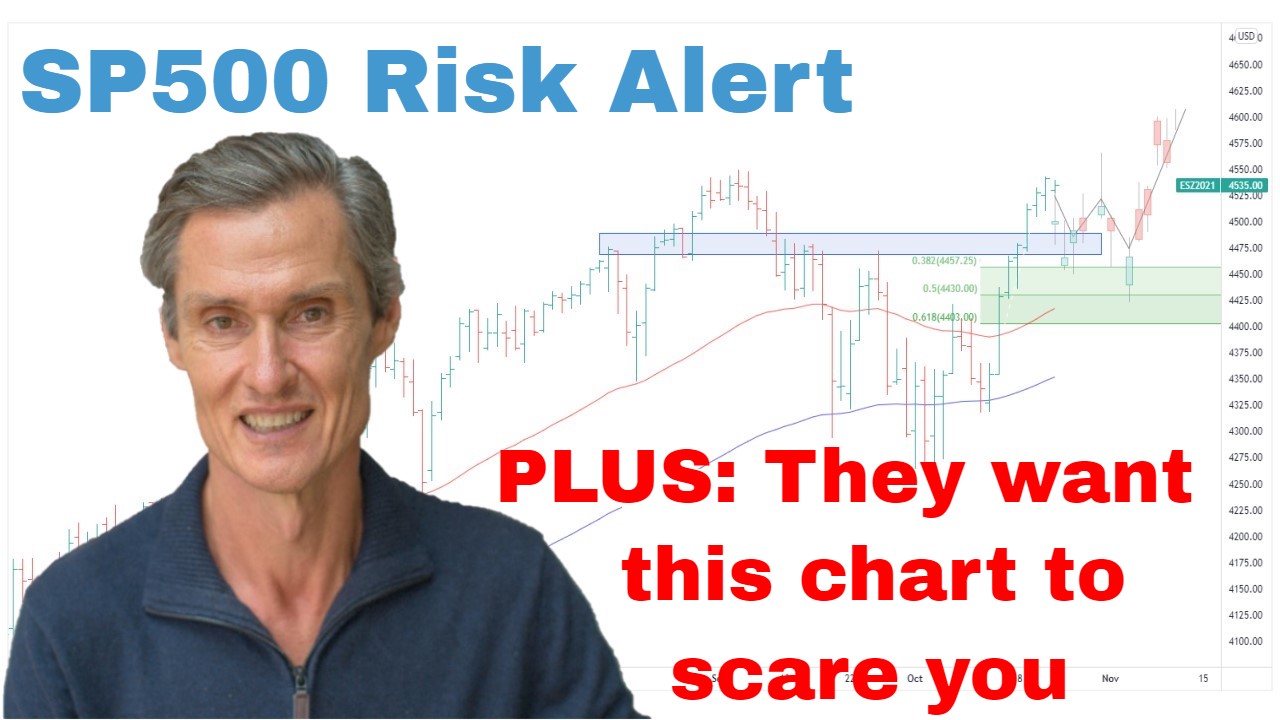
SP500 Risk Alert This Chart Will Scare You | Episode 135
Where is the Stock Market Heading?
00:00 Intro
00:30 Did the SP500 just do a false break?
03:35 This is why risk is rising
04:29 Look at what this stock just did (what it means for the market)
05:50 This key market needs to come into line
06:36 An important development in this ETF
07:26 This is what the markets are currently missing
08:41 This is designed to scare you (did it work?)
Transcript
Please note: Charts available from video
This video is going to focus on the S&P 500. I’m going to cover the ASX 200 as well as gold and copper in a second video. You can view that video here. I’ve also got a fascinating graph for you. It’s a graph that’s going to scare a lot of people out of the market, so make sure you stick around for that. As always, this is general commentary. It doesn’t take your personal situation into account. With all of that said, let’s get into our first chart.
So, as always, we have the S&P 500 up on the screen. And quite a bit has happened over the last week. So, last Thursday, the big development was the market broke to a nine-month high, the highest closing level since August last year, and also took the market just beyond the edge of this resistance band at around 4200. And this has been a big level going back to around May last year, so about a year ago. Just started to nudge above there. But what’s happened over the last few days is we’ve got a pullback. The market’s come back below resistance back within the range. And so, the big question now is, was this a false break, or are we really still going within a band of consolidation before potentially breaking higher in the weeks ahead?
Now, one of the things I’m watching for… I’ll show you one of the things, which I think we really need to be aware of in regards to false breaks. So, just going back to this period back here in December ’21. We had the market consolidating, and then it broke higher, broke above resistance, didn’t stay above there long, fell back beneath there, and then that resulted in a whole unraveling of the market.
Now, I’m not suggesting that’s what’s about to happen now, but it just goes to show why you need to be aware of false breaks, why you need to be aware of when a market breaks above resistance, if it doesn’t get follow through, on this case on the upside, it’s a point of concern, a point of vulnerability in the market that you need to be aware of. So, I think we need to watch this closely over the next week. I think it’s too early to jump ship on this overall rising momentum that’s been in place for several months now. So far, we’ve only just come back to the 50-day moving average. We have the 100-day moving average below that, and we’ve got this broad band of support coming in at around 4050.
Now, I’ve been saying for I think the last several weeks really that I favor that the odds are that we eventually see an upside break out of this range. But I think the risk is increasing. I think there’s increased risk in the way these markets are currently setting up. Now, I’ve been talking about this theme recently about upward momentum being quite narrow. This has been really centered on a relatively small number of stocks. And the problem I’m having looking at these markets now is I think that list of stocks which are rising, which are driving the market, is starting to narrow further.
So, I’ll show you what I mean by that. What I’ve got here, I’ve got a comparison chart. Chart at the top is the S&P 500. Below it is the NASDAQ 100. And just over the last week, we’ve now got divergence between these two key indices where the NASDAQ 100 has just made a new high, and it hasn’t been confirmed by the S&P 500, which as you can see, as you look back over this chart, the two have moved fairly well in line over the last few months, really over the last year or so. But we are starting to see some divergence creeping in, which I think really does increase that risk level, it increases it up a notch.
And so, it’s really only the NASDAQ 100 making those new highs. And that itself is being driven by largely this stock here, Nvidia. And look at what it did on Thursday, up something like 30% at one stage. And look at the volume. Volume in that stock has been huge. So, this has all been driven by AI, and what people are thinking is going to be a big driving factor behind the market. And maybe it will. This could be a really big ongoing theme that develops. But the stock market is more than one or two stocks. And so, this is a concern, this narrowness, that things are being driven by only a small number of stocks. And we’re just not seeing that strength reflected elsewhere.
Now, I’m going to talk a bit more about that in a moment. I just got a couple of other things I want to show you. But first of all, if you’re getting some value from this, please hit that like button. Leave a short comment, just “Hey, thanks for the video.” It just tells YouTube you’re watching, you’re engaging, and then YouTube will do what YouTube does, and show other people. And that helps me a lot, so please do that. And hit that subscribe button if you haven’t already done so.
Now, just to wrap up with a few other things. Now, I want to show you… I want to talk about the Dow just briefly in terms of where we are not seeing this strength reflected in other indices. So, NASDAQ 100 has made a new high, S&P 500 is close, but hasn’t quite got there. Look how the Dow’s been going over the last few months. It’s now starting to roll over. It’s hit a new…what’s that? It’s probably about a two-month low just this week. It’s below the moving averages, and it doesn’t look bearish, but it’s not confirming those highs. So, this is this whole point about the narrowness of the current rally.
We bring this down to another key area that I’ve been focusing on recently. And this is the S&P 500 Equal Weight ETF. Now, again, just like the Dow, new two-month high on Thursday. And we’re a long way from making a multi-month high. S&P 500, not too far off, but the equal weight is just a long way off, and also below these moving averages, the 50 and 100-day moving averages, which are themselves in decline. So, when a market is below those moving averages, it’s a point of vulnerability. So, we’ve got all these indices, which are not confirming what we’re seeing in the strength, in the NASDAQ 100. So, I think things to be extra cautious about.
Quickly, the Russell 2000, the small caps. Same story. Stuck below these moving averages. We have had a rally off below over the last couple of weeks, but it’s failed as it’s got towards those moving averages and started to come down again. Still within a range, hasn’t broken down, but remains vulnerable. And as I’ve been saying over and over again, healthy bull markets require broad participation. And that’s currently missing. It’s missing when we look across all these markets we’ve just looked at.
This isn’t a reason in itself to be bearish, but I’m just growing extra cautious seeing that divergence in the S&P 500 now. For me, I think extra caution is really required. For me, that means extra cash. It means low or even no leverage, and it’s avoiding stocks in downtrends. It’s not about trying to pick a stock, trying to get in at the absolute low. If I’m going to buy something. I want to buy something which is trending higher, which has momentum, and that increases my odds of making some money from it. I don’t want to be buying downtrends at any time really, but especially when we have this vulnerability, which seems to be creeping into the market.
Now, I’m going to finish up with one more thing. Really interesting graph. It’s a graph I’m seeing more of, the graph that scares lots of people out of the market. It’s this one here. It turned up on my Twitter feed during the week. Now, what this guy’s done, he’s got a chart of the S&P 500 from 1929. S&P 500 didn’t exist then, so it’s like a composite S&P 500 about what it would have been had you used that same collection of stocks. And he’s compared it to the S&P 500 in present day. And, well, from a quick glance, you can see that the two charts look similar. He’s even got these little rises and falls, and found similar movements in the current day S&P 500, then you got a big bull market. And, of course, back in ’29, it was a cataclysmic crash. And he’s given the… You infer from what he’s got down here. You got a 60% fall or a 90% fall.
Now, really and truly, I’ve seen people put up these overlay graphs comparing different time periods ever since I started in the markets in 1991. I think they’re nonsense. I think they scare people. I think people look at this and go, this is setting up for a 90% fall.” I think that’s absolute rubbish. You see these charts, they’re designed for sensationalism. They’re designed to scare you. Markets typically will not repeat exactly what they’ve done in the past. It’s a completely different market now. You can find these similarities. You can pull up a chart of anything, and you’ll eventually find something where you can do an overlay on to scare everyone.
So, I think there’s some risk in the market at the moment. I think there’s some extra risk, but when I say that, I’m not talking about a 90% decline. I’m talking about let’s see how this unfolds. Let’s manage our risk. Let’s be careful. Let’s use risk management to get out of stocks which are in decline. And I’m still maintaining a long S&P 500 position. I’m still long stocks. I’m not running for the hills, but I’m aware that there is a point of vulnerability currently setting up in these markets.
So, let’s leave it there for this week. Hopefully, that’s been interesting. Hopefully, it helps you with your portfolio and your management. And I look forward coming back and talking to you next week. Till then, bye for now.
Please see video for more detailed analysis and charts
Looking for the best ASX stocks to buy now?
Motion Trader‘s algorithms scan more than 2,000 ASX stocks daily in search of medium term investment trends. We then tell our members precisely when to buy shares. And most importantly, we tell them when to sell.
Try a no obligation FREE 14-day trial of Motion Trader, and see what an algorithmic trading approach could do for you.
Meet Jason

I'm Jason McIntosh, the creator of Motion Trader. My career began in 1991 on the trading floor at Bankers Trust. Nowadays, I trade my own systems from home in Sydney.
Motion Trader is for investors who value robust analysis, data driven entry and exit signals, commentary, and education. I use engineered algorithms to identify when to buy and sell ASX stocks. No biases or guesswork, just data driven signals.