SP500 Defies Bears | HIGHER Levels Ahead | Episode 52
By Jason McIntosh | Published 23 July 2022
Trade the Trend is a weekly video focusing on where the stock market is going. It’s for investors and traders looking for insights to the market’s next move. Jason uses technical analysis of stocks and trend following techniques to help you piece together the world’s biggest puzzle.
Where is the Stock Market Going?
00:00 Intro
00:28 SP500 breaks to the topside. Is this the start of a new bull market?
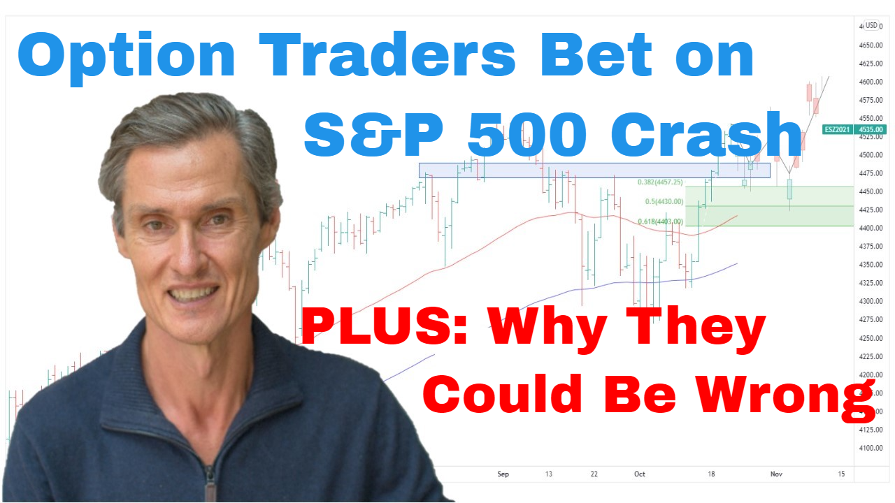
04:10 Option trades are betting on a crash (plus why they are probably wrong)
07:11 Look at what the big fund managers are doing (and what it means for stocks)
08:59 Could US small caps lead the way, again?
11:15 How should you play this developing situation?
12:53 These are the key SP500 levels to watch
Transcript (abridged)
Please note: Charts available from video
It’s been an incredibly interesting week for the S&P 500. You might remember last week I was talking about the possibility of the S&P 500 rallying. My thoughts that the market could rally were based on a few factors, but one of the big ones was that the S&P 500 wasn’t reacting to bad news. And the bad news that we just recently had, which the market brushed off, was a big inflation number.
Now as you can see just through here on Wednesday and Thursday of the previous week (see video), the market did try to sell off. But what was interesting was that when the market broke below the June low, it wasn’t able to generate further selling. The market then snapped back and started to rally. And when I see that price action develop on a chart, what I really start to wonder is, has everyone who wants to sell already done so? And it’s been interesting over the last few days to see that S&P 500 put on several strong days.
What’s been interesting with the most recent price action is we’ve been able to draw in a bullish flagging formation on the chart. And we can only do that now because we’ve had to wait for this key point to get the lower trend line. And that developed last Friday. And so we’ve got this pattern and now what we have, we’ve got a breakout from the pattern. And another thing that’s happened is that the S&P 500 has closed above the 50-day moving average for the first time since April. It’s been quite a stretch of weeks, or really months of being below this 50-day moving average.
The question is, does this mean that a new bull trend is under way?
Well, unfortunately, I think you have to say it’s too early. The S&P 500 is still below the 100-day moving average, and both the 50 and 100-day moving averages are trending lower. That’s why I say it’s too early to consider this a new up trend. Whilst the moving averages are declining, the primary trend remains down. So I think at this stage, the odds favour the strength we’ve been seeing over the last few weeks is a bear market rally. Having said that, we always want to keep an open mind, and we want to assess new clues and we want to assess new pieces of information as they come to light.
Now what I want to do, I want to show you a couple of graphs which act as pieces of this bigger puzzle we’re trying to put together in terms of where the market is going. And they turned up in my Twitter feed through the week. Now the first one is from the J.P. Morgan Equity Derivatives Strategy team. It involves call options on the VIX or the volatility index. And what’s interesting on the graph is that it essentially shows us the number of options that are being used to bet on a crash. And as you can see, it’s off the chart. The graph goes back to 2015, and the increase in the number of options betting on a crash has just skyrocketed since the start of this year, and has continued over the last few months.
I want to focus on this level here: 40. This is the price on the VIX which all these options start to kick in. Let me quickly jump over to a chart of the VIX. And I’ll explain what this 40 means. It becomes a little bit clearer when you look at it on a chart. So this is the volatility index. And over the course of this year, it’s been in this big contracting range. You can see these green trend lines. It’s been in this big contracting range. Now this red line here is 40. That’s where all those bearish options start to kick in.
Now here’s a thing, only way for the volatility index, or the VIX, to get from where we currently are at around 24, to up to above 40, is for a spike in volatility. You need to get a really big upward spike in volatility for these options to really start to pay off, like we saw during the COVID collapse. And the way you get a move like that is for the market to crash. And one of the things we know about markets is that if just about everyone is anticipating an event, it’s probably not going to happen. So the fact that there’s so much activity going on in these call options betting on a crash, to me, it means that it’s much less likely that it’s going to happen.
I’ve got another fascinating graph which turned up, and this is from the Bank of America Fund Manager Survey. This one involves risk-taking of big global fund managers. What the graph shows is that risk-taking is below the level since October 2008, which was right after the steepest part of the GFC crash. It wasn’t the final low but most of the damage had already been done.
The second graph on the screen shows fund managers’ equity allocation versus cash. And again, you can see it’s at levels last seen during the depths of the GFC, and it’s below levels seen at the tail end of the COVID collapse. So there is some pretty extreme stuff going on in terms of how the market is positioned. None of these graphs tell us that the final low is in. But what they do indicate is that a lot of selling pressure has already come out of the market.
Another interesting development is in the Russell 2000, which is the U.S. small-cap index. What we see with the Russell is that it’s broken out of this bullish wedging formation. The wedge had been forming since late January. What’s interesting here is that the Russell was one of the first markets to indicate trouble. Now is it one of the first markets to give us a positive sign on the upside?
We need to be aware that the moving averages still haven’t turned higher, but the price action is at least encouraging. It is something to keep an eye on and see whether this bullish wedge formation does continue to lead to higher levels developing.
So what does all this mean?
As I said earlier, I think the odds favour a bear market rally. But just looking at those previous graphs, there seems to be plenty of fuel to potentially push the S&P 500 higher over the next few weeks.
So how could you play this?
Well, this is what I think. I think the cautious play is to wait for these moving averages to turn higher. This approach is always going to get you in late… you never get in at the bottom when you’re waiting for moving averages to turn higher. But what that also does, it helps you avoid bear market rallies which happen so frequently during these periods.
If you were letting the moving averages help you, you would have not bought into the March and April rallies. So the moving averages can keep you out of trouble, and help you stay out of bear market rallies that can be both be financially and emotionally damaging. So there’s a good reason to respect those averages.
A more adventurous approach is to consider some market ETFs. I think these are probably a safer play than individual stocks at this stage because the chances of an individual stock coming out with bad news and being hit hard is probably greater than it is for the whole market to collapse.
Ideally, what we want to see develop is for the market to consolidate the recent breakout over the next few days, maybe the next week, and then start to punch higher. We want to see a decisive break above 4,000 which is still keeping the market in check. I think if it can do that, I think that could be a catalyst for more buying to come in. What I’ll be looking at on the downside is I’ll be keeping a close eye on 3,800, which would break the low from Monday the 18th. And should that happen, then we start saying considering whether this has been a false break.
And then after that, the key level to watch is 3,700. A break below there would put us back on alert for a new low. But I think the risk of a crash has receded. The fact that the markets couldn’t sell off on bad news lowers the risk of a sharp decline over the next several weeks. Also the fact there are so many investors positioning for a crash, I think that also makes that risk of a big crash recede. But it doesn’t discount the fact that the market could test lower, it could make a new low, it could chop around, and it could be difficult.
Please see video for more detailed analysis and charts
Looking for the best ASX stocks to buy now?
Motion Trader‘s algorithms scan more than 2,000 ASX stocks daily in search of medium term investment trends. We then tell our members precisely when to buy shares. And most importantly, we tell them when to sell.
Try a no obligation FREE 14-day trial of Motion Trader, and see what an algorithmic trading approach could do for you.
Meet Jason

I'm Jason McIntosh, the creator of Motion Trader. My career began in 1991 on the trading floor at Bankers Trust. Nowadays, I trade my own systems from home in Sydney.
Motion Trader is for investors who value robust analysis, data driven entry and exit signals, commentary, and education. I use engineered algorithms to identify when to buy and sell ASX stocks. No biases or guesswork, just data driven signals.