Trade the Trend | Episode 35
By Jason McIntosh | Published 8 April 2022
Trade the Trend is a weekly video focusing on where the stock market is going. It’s for investors and traders looking for insights to the market’s next move. Jason uses technical analysis of stocks and trend following techniques to help you piece together the world’s biggest puzzle.
Where is the Stock Market Going?
00:00 Intro
00:21 Where is the S&P 500 going?
05:31 Why S&P 500 upside could be limited
08:08 Will European stocks recover?
11:20 Where is the ASX 200 going
14:15 Why is the ASX 200 rising?
17:47 Which ASX stocks should I sell now?
Where to invest now?
Looking for ASX stocks to buy now, as well as off the radar ideas most people don’t know? Our algorithms scan the stock market daily for medium term investment trends. We then tell our members precisely when to buy shares. And most importantly, we tell them when to sell.
If you’re ready to get started, try a no obligation FREE 14-day trial of Motion Trader, and see what an algorithmic trading approach could do for you.
Transcript
Please note: Charts available from video
Welcome to this week’s edition of “Trade the Trend,” a weekly video discussing where the stock market is going. I’m Jason McIntosh. It is Friday, the 8th of April, 2022. As always, this is a general commentary and doesn’t take your personal situation into account.
All right. With that said, let’s jump to our first chart of the S&P 500.
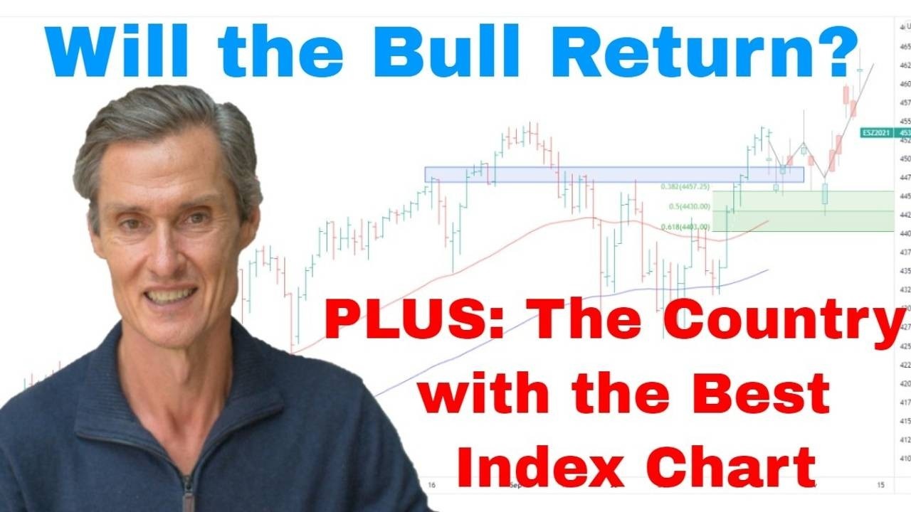
Well, after all the excitement of the previous two weeks with the S&P 500 rallying 12%, we’ve had a quite a few days with all the price action slowing down. And we spoke last week about the potential for some sort of a pause in the market and some sort of a pullback because the case which I put forth last week was that market had gone too far too fast. And this has been pretty much the case over the last… we’ve seen a general pullback in equities. There hasn’t been a great deal of volatility to it. And I think we might be in for the same sort of price action in the week ahead.
So, let’s jump over to the hourly chart and have a closer look at this price action that we’ve had. Let’s put on some Fibonacci retracement levels. What we’re going to do, we’re going to look at the retracements for this 12% rally use that to gauge where we are now. So, let’s do that.
This is so interesting when you look at these Fibonacci retracements because it’s uncanny how often they do tend to act as a magnet for the market. And when we look at this, you could say the market has done the bare minimum. It’s come right back to just above the 38.2% retracement.
What I think we could see over the next few weeks, maybe the next month even, I think we might need to spend some more time within this range. It’s always hard to work out the timeframes, but you’d expect some sort of balance perhaps if that would happen. That could be the first half of the move, perhaps. And what we could see happen if the S&P 500 rebounds off this support, maybe it’s a case of it rallies back up towards those highs from a couple of weeks ago. And then from there, maybe we do get another pullback, and then from there maybe we start to look to move higher. So, we get more of this zigzag sort of correction.
And I was talking last week about the possibility of a 5% pullback. So, 5% pullback of this rally will take the market back to this 50% retracement level. So, look, I think if we’ve got something like that, I think that 5% pullback is still on the table. When I do these drawings about what could happen, it’s important to always remember they’re just possibilities, they’re not predictions because I don’t know. I don’t know what the market is going to do next. The market could continue upwards to a new all-time high. I don’t think that’s going to be the case, although you always need to be open to the possibilities. And we’ll get into this a little bit more as we go through today’s video. I think it’s more likely we’re going to see the S&P 500 do more work within this broader range. And maybe it ends up looking like this (see video). Maybe it doesn’t. We’ll have to wait and see.
I just want to jump to a four-hourly chart because it gives us a little bit more detail. It’s also good to get an idea of where things are. It could end up being something like a broader sideways period before we start to see some sort of move to the upside again. But I do think that the upside in the S&P 500 at least over the next few months is probably limited. I just don’t think this market is going to be looking at breaking into a new all-time high for the next few months. And if it does, I think it’s going to be temporary, and I don’t think it would get too far.
Let’s jump back to the to a daily chart. I’ll tell you why I think the upside could be limited over the next few months. If we just measure from the current S&P 500 price level up to the January highs, it’s about a 7% move. It takes a 7% rally for it to get up to its highs. So, that’s not too far. That’s within shooting distance. Considering it rallied 12% in two weeks, the S&P 500 could be at all-time highs within a week. I don’t think that’s going to happen though.
Let me now go to the NASDAQ, the other part of this puzzle, because you get a quite a different picture in terms of the depth of the NASDAQ’s decline and the distance NASDAQ is to its previous high. Let’s just measure that. From where the market is now, it would require almost a 15% rally for the NASDAQ to get back to its all-time high. And I don’t think that’s going to happen in a hurry. I think the U.S. market it’s going to need more time to consolidate the rally from the Covid lows.
And if the S&P 500 were to break to a new all-time high sometime in the next month or two, chances are the NASDAQ doesn’t. And if the NASDAQ doesn’t, then you get divergence in the market where one market is not confirming the other. And given how tech-heavy the U.S. markets are and the amount of tech within the S&P 500, I just don’t think that the S&P 500 could sustain new highs without the NASDAQ coming to the party and joining in and making new highs as well. And I just don’t see that happening at the moment. I think this market needs more time and I think it needs to do more work before we can really look at the prospect of a longer bull market reestablishing in the U.S. And I think another issue is the overall position of global equities.
I want to look at some of these international markets. Let’s start with the Stoxx 50 in Europe, because this is quite telling us on. There’s a resistance band through here at around 4,500. You can see what I’m doing here. I’m using some highs from here. There’s a bit of work being done through there. And it picks up another low point. There’s are some more low points here. So, it’s quite an active region of support which has now become resistance because we’ve broken to the downside. We’ve had this strong rally back up. Let’s just put our Fibonacci retracements on. And there we go. The Stoxx 50 has come back to the 61.8% retracement which coincides with this big resistance band. And now the market has started to roll over again.
So, to me, this is a structurally weak market. And for me, it looks like this needs time to repair, and also it looks like it’s going to test lower. I couldn’t discount that this market will retest these lows at some point over maybe the next month or two. It doesn’t look strong. We’re below the 50 and the 100-day moving averages, which means this is still a vulnerable market. And this is a large part of the global equities.
And if we go and we look at the DAX, the German market, we’ve got the same thing. We’ve got this resistance band above the market. The market is rolling over. We go to France, and it’s the same sort of picture. Then you can look at the UK market. The FTSE 100 is looking a bit better, but we’ve got this V shape price action. We’ve got this distinctive V shape here, which, at best, I think the UK market would probably stall around this previous high and then pull back. And maybe it needs to do some work before you could potentially look at it rallying again, but for now, I’d say Europe in general looks structurally weak. So, that’s going to be a weight upon global equities.
The U.S. market looks like it needs to do work. At best, NASDAQ needs to do some more consolidation before we can look at new all-time highs in that. So, I think the next few months is going to be more sideways movement. It’s going to be back and forth. We could see the markets move a bit higher, but then I think that’s also going to be tempered by some further falls. So, at best, I think global equities are neutral, but probably with a bearish tilt. I don’t think it’s anything particularly dire, but neutral to slightly bearish would be my take on the U.S. and European indexes at this point.
Now, let’s jump over to the ASX 200. This is quite a different setup, it’s really very interesting because the ASX 200 looks different to most of the global indices. And I’d actually say that this is looking like a structurally strong chart. And if we look through all those global charts from the U.S., Europe, also through Asia. If I had to pick one, if I had to pick one index to buy, it would be the ASX 200 at this point in time.
And that’s based on a balance between the potential reward I could see through buying it, but also through the potential downside risk. I think this is the market with the least downside risk at this point in time. It’s interesting. It lagged the U.S. from the 2020 lows, but now it’s looking like it could be going into a period of outperformance.
So, let’s have a closer look at this chart. So, the key feature on this is this double-top resistance, which we have in place at around 7600-ish. And I think the base case would be the ASX 200 would at best need to consolidate a bit more below this big resistance band. But then, after we get some consolidation, I think this market is getting ready to punch above to a new all-time high. I think that is what the structure looks like it’s going to do.
It’s quite often when you get the double-top, you come back to get the retests, the market pauses, and then it punches through. It doesn’t match with what we’re seeing in global equities. But if we look at this chart on its own merits, that looks like the most likely scenario. And maybe it doesn’t play out like that. Something else could well and truly happen. But even though it may seem unlikely against the global backdrop, it pays to keep an open mind to the possibilities. And I think this is a very real possibility for the local market.
So, then we think, what’s driving the ASX 200? And the answer is resources and some of those value names like CBA (ASX:CBA) and National Australia Bank (ASX:NAB). And other players in there too, but they’re two of the significant value-orientated players which are helping hold the market and also take it higher. And on the resource side, it’s those big miners line BHP (ASX:BHP), Rio Tinto (ASX:RIO), Fortescue (ASX:FMG), as well as the supporting cast of other resource plays, which is really bolstering this local market.
I’ll show you what I mean. Let’s start with a quick look at BHP. So, let me get the Australian listing of BHP. And so BHP is up near new all-time highs. And what’s also interesting, I’m going to click this button here which is Adjust. So, that’s going to adjust for the dividends because part of this fall here, well, a big part was due to the iron ore price collapsing, but BHP was also paying some very large dividends through there. So, if we hit this Adjust button, look what happens to the share price. BHP has really been on the tear for almost four months now. Really strong upward trend there. Moving averages are positive. It’s a strong-looking chart. It’s an uptrend with no sign at all of the top and the momentum is strongly in place. Same goes for Rio Tinto. When you come over and have a look at Rio, again, we’re looking at it with the adjustment for dividends, it’s also at a new all-time high which is very different to the tech-orientated stocks which has heavily dominated the indices in the U.S. So, this is one of those reasons for the ASX200 is outperforming.
And let’s have a quick look at CBA, Commonwealth Bank. And you see something similar. The market held across this support region at $92 since July. It held that support really well during the latest market volatility. And it looks like whilst there could be some sort of consolidation below resistance around $108, it looks like it’s shaping up for a punch higher at some point in the not too distant future.
And then we look at National Australia Bank. And you get this same pattern, same reoccurring pattern in that we’ve got an uptrend, we’ve got a stock which is trading above those moving averages. It’s, again, a strong stock which is helping bolster the Australian market.
So, all that said, I think it’s still really important to be highly selective. If you’re buying Australian stocks, if you’re buying ASX-listed stocks, I think it’s important to be highly selective because I’ve showcase some of the strong performance, some of the best-looking charts, they also happen to be some of the largest stocks. But it’s not all sunshine and rainbows in the ASX because there’s some pretty ugly-looking charts as well. I’ll give you an example of why it’s really important to be selective here particularly with this global backdrop. If we look at a stock like Aristocrat Leisure (ASX:ALL). Aristocrat is in the ASX 20. It’s a big ASX stock. But look at these moving averages. Look where the share price is… it’s below the moving averages.
The 50 and 100-day moving averages turned lower and Aristocrat is trending down. This isn’t a case of buy the dips. If you want to buy the dips, you buy the dips when the price is above the moving averages. Now, it’s below the moving averages, it’s a case of sell the rallies. It’s like get out of this stock because the risk-reward is not favorable. It could bottom here. It could turn up, but the path of least resistance at the moment is to the downside. And there are plenty of other stocks like Aristocrat in the ASX. So, it’s not a one-way traffic by any means. And this is one of the things I’m doing with my Motion Trader subscription service is that I’m using the algorithms to filter out the stocks which are trading below the moving averages and I’m only using it to identify stocks where the momentum is positive and the moving averages are up and the share price is above the moving averages. That’s where the opportunities are.
And I’ve been seeing some really interesting players over the last couple of weeks. So, while some of the buy the dip players are looking at stocks like Aristocrat, I’m focusing on stocks like BHP, like the banks, like Rio Tinto where I got the positive upward momentum.
And it was really interesting. I looked at my personal Motion Trader portfolio through the week. And over the last 12 months including dividends, my portfolio is up something like 28%. Compare that to an ASX 200 fund, including dividends and it was up about 14%. So, that’s the advantage of having this filtering system.
So, let’s say you buy an ASX 200 fund. You’re getting BHP and you’re also getting Aristocrat. If you’ve got a filtering system that can take out the Aristocrats but stick with the BHPs, that’s where you could get your outperformance. So, there’s a real benefit to being able to have that separation where you can focus on what’s working and avoid what’s not.
Meet Jason

I'm Jason McIntosh, the creator of Motion Trader. My career began in 1991 on the trading floor at Bankers Trust. Nowadays, I trade my own systems from home in Sydney.
Motion Trader is for investors who value robust analysis, data driven entry and exit signals, commentary, and education. I use engineered algorithms to identify when to buy and sell ASX stocks. No biases or guesswork, just data driven signals.