Trade the Trend | Episode 34
By Jason McIntosh | Published 1 April 2022
Trade the Trend is a weekly video focusing on where the stock market is going. It’s for investors and traders looking for insights to the market’s next move. Jason uses technical analysis of stocks and trend following techniques to help you piece together the world’s biggest puzzle.
Where is the Stock Market Going?
00:00 Intro
00:21 Where is the S&P 500 going?
08:32 The seismograph for stocks
11:19 Where is the ASX 200 going?
17:00 All Ordinaries vs S&P 500 (long term ratio)
21:27 Where is gold going?
Looking for a free stock market training course?
Learn how to identify some of the best stocks to buy now in this free video training. You’ll learn a complete stock trading strategy for buying and selling shares with confidence. We’ll also share real life examples to help you apply the knowledge and build a profitable share portfolio.
Where to invest now?
Looking for ASX stocks to buy now, as well as off the radar ideas most people don’t know? Our algorithms scan the stock market daily for medium term investment trends. We then tell our members precisely when to buy shares. And most importantly, we tell them when to sell.
If you’re ready to get started, try a no obligation 14-day trial of Motion Trader, and see what an algorithmic trading approach could do for you.
Transcript
Please note: Charts available from video
Welcome to this week’s edition of “Trade the Trend,” a weekly video discussing where the stock market is going. I’m Jason McIntosh. It is Friday, the 1st of April, 2022. As always, this is a general commentary and doesn’t take your personal situation into account.
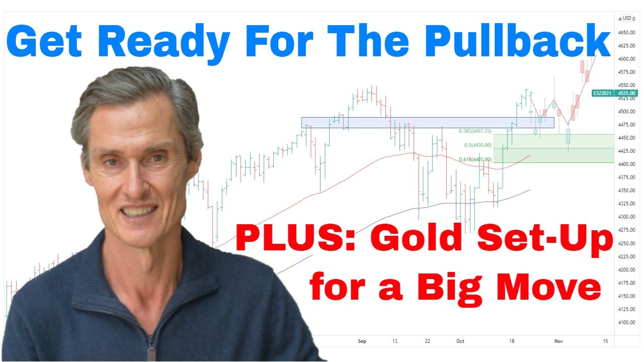
Well, with all that said, let’s go straight to our first chart. Well, I’ve got the chart of the S&P 500 in front of us. And really what a couple of weeks we’ve had. So how’s this for a combination? We’ve had a rate hike, and we’ve had a stock market rally. Now, that’s not a combination a lot of people were expecting, and we know a lot of people weren’t expecting this because of all the hedging activity we were seeing as the market was down here.
We had a look at some charts recently about all the volume that had been going through those inverse market ETFs. There’s been a lot of put buying. There’s a lot of fear. There’s a lot of concern the market was going to crash. And this so often happens at important turning points. We get people going out there, hedging, getting short, and then, you know what happens, the market does the opposite, goes the other way. And I’ve seen this happen so many times before. And I think that’s really what’s been happening here. I think what we’ve been seeing through here, I think this is really a classic short-covering rally. And we’ve seen the market put on, well, from these lows through to the higher couple of days ago, put on 12%. And if you just look through here, there are only really a couple of down days in this whole rally. So it ranks as one of the strongest rallies which you’re going to see in a market.
Typically, this happens after some sort of a low point as the market does exactly what it’s been doing, short covering, and that’s how powerful these rallies can be. And it’s really about all that pent-up energy which was put in place down here, all that negativity, and what that’s resulted in is the market sling-shotting in the opposite direction. And, look, I think it’s really interesting to look at this and think about how all this has come about, because like we were talking about the potential of this, oh, look, I think it was three weeks ago. It was actually three weeks ago we started talking about the possibility of, assuming, a 5% to 10% rally. The big thing we were talking about was this bullish wedge formation which started to appear on the charts.
So three weeks back or some…I think it was around about here. It would’ve been around here that we started talking about whether this was a bullish wedge forming. And we started looking at it, we started talking about the possibilities, and it just goes to show…it shows the value of looking at charts in trying to analyze the market and put together the possibilities of where things could be going. Because this pattern really did help identify the shift in conditions that was happening here.
The theory of the bullish wedge is that as the price starts to contract within the range, the market’s really starting to lose its downward momentum. The energy behind the momentum is starting to dissipate. Now, these patterns, they can sometimes accelerate to the downside, but more often than not, you find they do lose steam and you get this snapback in the other direction.
So, this is one of the great things of charts, not just bullish wedges, but charts in general, because they help identify the conditions and changes in conditions, and they help map out possibilities.
We were speaking three weeks about the possibility that the market could collapse or whether there could be a short-covering rally. And we had strategies in place if the market collapsed. They’re our exit stops or stop loss orders. But unlike a lot of people who got themselves so heavily hedged fearing the worst, if you’ve been using trailing stops, risk management strategies, you’ve kept yourself in the game with the market rallying. It’s always interesting to reflect on this through the charts and get your ideas and how you can manage and play out these situations. So, the question now is, where to from here, where is the stock market heading from here?
And I think what we have at the moment is a market which has gone too far, too fast. 12% in 2 weeks, that’s a cracking rally, and that pace of advance is just not going to continue. We can be pretty certain of that. And I think what we’re going to see now, well, I think maybe we’ve already started to see it just overnight on Thursday in the U.S., I think we’re starting to see signs of a pullback. Now, I’m not expecting that we’re going to get a retest of these lows anytime soon. That’s a possibility maybe a month or two out, but it’s not the scenario I’m looking for at the moment.
Let’s put some Fibonacci retracement levels on. They’re always good to give us an idea of where a pullback could come to. So we use the low point from the latest rally, and we use the recent high, and this gives us our Fib range, our Fib pocket in here. So, look, just measuring this out… from the high, that would give the potential for a 4% to 6.5% pullback. So that’s sort of our range. That’s what I think we could see develop maybe over the next couple of weeks. We have to wait and see. You can never put a timeframe on these things with any sort of precision. It’s all just estimates. But that would be a completely normal reaction with a market which has gone this far.
And what we could see… Look, maybe that’s not even the top. You can’t discount the fact the market could pop higher again. But then I do think we’re going to see it start to fall into this sort of range down here over the next maybe one to four weeks. We want to see how it pulls back, and then we assess what happens then. So is that’s a precursor for another run up here and a test of these of the all-time high, or do we see a sharper move down than a soft sort of bounce, and then we look for another leg lower?
So all options are on the table there. We’re just going to watch how this plays out. But I think that’s the base case at the moment that we do look for some sort of pullback in the S&P 500. And expect these larger oversized moves to continue, at least for the near term, because it’s a bit like a pendulum in that once they gain momentum, they tend to hold it for a little bit, it takes them a little while to settle down. This was a sharp decline through here, and this was a sharp rally, and here’s another sharp decline and sharp rally. The pendulum just doesn’t hang on one side, it goes both ways.
So that’s why I say the prospect of some wider range days are still very much in there. Now, I’ve got another chart which I want to show you. And it’s an interesting chart… It’s another reason why I’m thinking this pullback is likely. This is an interesting one. It is the S&P 500 stocks above their 200 day moving average. Now, I’m going to put this onto a line chart because it’s a little bit easier to read, and I’m going to scrunch it up.
Now, it’s a bit of a crazy-looking chart. So don’t get overwhelmed with it at the moment. I’m going to explain it all on a sec. It looks more like a seismograph than a stock chart, but it’s a bit like a seismograph for stocks. Because what it’s doing, it’s showing the volatility or the extreme moves within stocks from being very overbought to very oversold.
Let me explain… anything in this blue band is showing more than 90% of S&P 500 stocks being above their 20-day moving average. And you can see it doesn’t happen that often. These are years down here. It may only happen once every year or two. It didn’t happen here for close to three years. That’s where we got to early this week. We got the 93% of stocks. And so that’s a pretty extreme sort of thing to happen. And what you can see when the market has gotten there in previous times, look how quickly it can pull back… it mean reverts back towards 50% or potentially lower. And like all these times through there, once it touches that 90%, it doesn’t hang there, doesn’t hang in that range because it’s just uncommon to have so many stocks in such a bullish phase. It always comes back.
So, I don’t think this is going to be any different now. I think this is another sign we are going to see this pullback towards 50%, which means the S&P 500 almost certainly has to pull back as well. So that’s my near-term thoughts on the U.S. market.
All right, let’s jump over to the ASX 200 because that is interesting as it often is as well. So, now, let’s go back to our bar chart for this. Now, I want to touch on this because it’s… look, I think the ASX 200 is going to get its near-term lead from the U.S. as it often does, but I think it’s looking structurally stronger overall than the U.S. market. Look how close the Aussie market is to getting back to these all-time highs.
I think this market is setting up to make new all-time highs, which is an extraordinary thing given how people were feeling about the market in early February. There was a lot of negativity and a lot of fear out there, but, look, let’s deal with the chart we have at the moment. So at the moment, on this chart, we’ve got a double top formation. We’ve got the high from August last year, the high from January. So we have a double top, and that’s around 7,650. Now, some people hear the word double top and go, “Well, look, that’s bad. Double top is bearish. The market can’t be strong.” But that’s not necessarily the case. So often I’ve seen this sort of structure result in higher prices.
I’ll show you an example. It’s handy when you’ve got an example on the same chart not too far away. And we do on this occasion. So let’s just expand that a bit. There was this period in 2020. Just through here… there’s our double top. We had a double top formation there, and the market pulled back from the double top, then it rallied back towards it, paused again, pulled back. And then we had the breakthrough, and the market didn’t look back.
It plays out differently every time and doesn’t always look like that. And what we have now is going to do its own variation of that. It may not even work out like that. The market could run straight through now, or it could pause here and fall away. We don’t know. We’re just going on patterns that have a history of playing out… but there’s no guarantee for now. But that’s what I think could be setting up now.
I think the best-case scenario for the ASX 200 would be for it to pause temporarily, like, maybe this U.S. market does have a pullback. Maybe we do see the market start to pause around here just for maybe a couple of weeks. But then from there, it forms a base, and then it can have another crack at the double top, and then potentially it punches through. I’ve seen this sort of pattern so many times in markets. If I’m going to have a base case for the Aussie market, that’s what it’s going to be.
I think the momentum is to the upside. I think the pattern is supportive of higher levels. And this pause fits in with the scenario which we’re seeing in the U.S., so, let’s wait and see. As I always say, this is about possibilities. We’re not trying to predict the future, we’re trying to identify the possibilities. And then we have our strategies to play those possibilities out. And as you’d know from listening to these videos in recent weeks, I’ve stayed long the market throughout this correction. I’ve seen commentators talk about going to cash and people talking about selling up, waiting for the next crash, that sort of stuff.
But the market hasn’t done that… it hasn’t given us enough sign that that’s what it was going to do. And if you’re using wide trailing stops on your portfolio, like I do with mine, like I do through my Motion Trader service. Motion Trader actually calculates the wide trailing stock for people so they don’t need to think about it themselves, if you do that, you can see off these moderate bounce of volatility. Yes, I lost a few stocks in my portfolio through this period, but I’ve held onto a lot more, and a lot of them are hitting new all-time highs. I would’ve been kicking myself had I lost my nerve through here and sold everything up. I’d now be up hoping and praying the market rolls down to give me a chance to buy back in. And that’s what so many people find themselves doing.
Meet Jason

I'm Jason McIntosh, the creator of Motion Trader. My career began in 1991 on the trading floor at Bankers Trust. Nowadays, I trade my own systems from home in Sydney.
Motion Trader is for investors who value robust analysis, data driven entry and exit signals, commentary, and education. I use engineered algorithms to identify when to buy and sell ASX stocks. No biases or guesswork, just data driven signals.