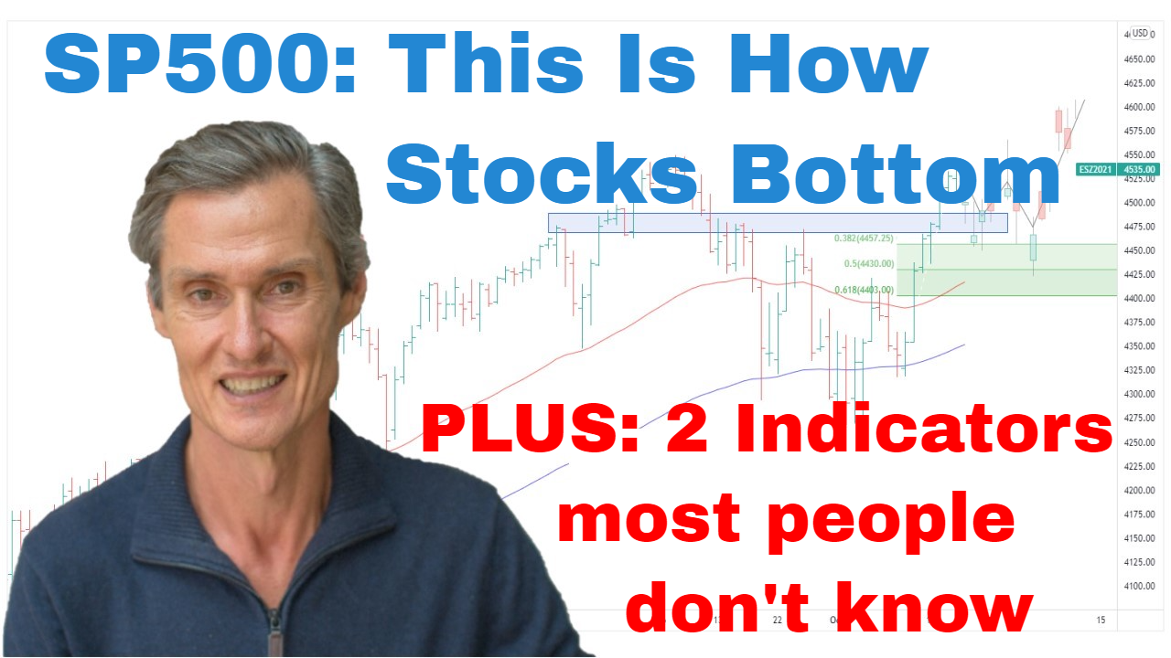
This is Exactly How Stocks Bottom | Episode 75
Where is the Stock Market Heading?
00:00 Intro
00:32 SP500’s moment of truth (and what it means now)
02:16 The scenario few people thought possible
02:54 This is why you need to be aware of false breaks
04:28 Three reasons to remain cautious
07:40 But take notice of these 2 key indicators (they’re positive!)
Transcript
Please note: Charts available from video
It’s been a fascinating week in the S&P 500 really, as well as global equities generally. Really last week, when we did the video, stocks were really potentially set up at any rate for a sharp move lower. And the S&P, just down here last Friday, it actually closed on its lows, and it was potentially really there for an ugly open on Monday for prices to fall away. But as so often happens in these markets, when the vast majority of people expect something to happen, well, quite often you find that the opposite ends up occurring.
And so let’s jump over to the four-hourly chart. Just get a little bit more detail on this price action that we had last week. And so what you can see here when we look at this price action, you can see where we were last Friday. You can see we got the breakdown point last Friday. That took us below the September and also the June lows. And now this was really the moment of truth, you could say, for the market, and that’s because key lows are often the natural place that you find sell orders, and that’s often a combination of people exiting stocks that they have in their portfolios and the bears coming in and short selling into a decline and trying to get that decline to then accelerate lower again.
But as we know, that’s not what happened. And one of the scenarios that we spoke about last week was the scenario where we could get a break at support, and if that doesn’t attract much selling, well, then that could instead trigger a short covering rally. And that’s what we’ve seen, and that’s also what we saw in some of the European markets as well.
Just quickly looking at the European STOXX 50, we had a breakdown below a key support last week at around 3000, just below 3400. Markets sat there for a few days, and now it’s back up above that support. So, false breaks like these, they’re often a sign that can lead to turning points, and they can be an early sign that the path of least resistance is starting to change. So, I’ll show you an example of what I mean. So, this is the Russell 2000 from earlier in the year. In fact, it was late last year. Been in a big range. We had a heavy overhead resistance band. The price broke out above that resistance but then started to stall within a couple of weeks, started to come back below the resistance. And what that did, that set the tone for what was to come over the next several months. And as we know, the market continued to fall away. So, the false break was a sign that there was a potential trend change taking place.
So, in the S&P 500, does that mean that a low is in? And you got to say the answer to that is not necessarily. It doesn’t mean it’s going to play out like that at all. There are some positive signs, but I don’t think we can say by any stretch that this market is out of the woods after one positive week. I’m going to show you some positive indicators in a moment that do give some encouragement that maybe at least an intermediate low is in place. But before we get to that, I want to start with some of the reasons that I think we need to remain cautious and some of the levels to watch.
So, firstly, we’ve got these moving averages. We’ve got the 50-day and the 100-day moving averages, and the price is currently firmly entrenched below those moving averages. And this will always be the case at a low. The market will always be below the moving averages at a lasting low, but they’re an indicator that really helps keep you out of trouble all the way through here being wary of the market as is below these moving averages. It’s really potentially helped to keep you out of trouble for much of this year. So, it will keep you out of the eventual low as well if this happens to be the case, but the grief it saves you is worth being a little bit late into a new advance.
So, I think we need to respect that the primary trend remains down. And I also don’t think we should be loading up on stocks at the first sign of a potential rally because you’ve got to remember, these bear markets, they’re notoriously difficult, and this one could still have some surprises. We could get a move higher potentially over the next several months, and then another round of selling into the second quarter of next year. You just don’t know. You don’t know the pathway that these bear markets take. So, it’s really a case of treading cautiously. And we’ve also got this overhead resistance coming in at around 3900.
And another thing we can do, we can just quickly add some Fibonacci retracements to that last decline. And you can see that the rally so far has just come to the lower end of the Fibonaccis. This market could feasibly continue to rally over the next several weeks, get a little bit higher into the Fibonacci range, and then start to roll over and retest that low and fall away again. So, as I say, the market is not necessarily out of the woods after one good week. It’s encouraging, but that’s why I say tread cautiously. There could still be surprises to come.
So, let’s move on and look at some of those positives which I’m seeing in the market with some of these technical indicators. But before I do that, if you’re getting value from this video, please hit that like button, and please leave a short comment, just “Hey, thanks for the video.” It tells YouTube people are engaging, people are watching, and if YouTube picks up on that, well, then it puts the video in front of more people. And that helps me so much because I spend a lot of time doing these, preparing, and recording, and uploading. I want people to watch them, and YouTube will only do that if people like yourself are commenting and giving me a like. So, please do that. Also, subscribe. Come over and visit me at motiontrader.com.au, and that all makes it worthwhile for me to help you by doing this stuff. Okay, so back to our charts.
So, there were some rays of light through the week as we’ve been speaking about. So, let’s go through and have a look at that. So, what I’ve got here, this is a weekly chart of the S&P 500, and what I’ve got below it is a rate of change indicator. So, a rate of change indicator is basically a momentum indicator. And what’s interesting here is that the S&P 500, as we know, it marginally made a new low last week, but then when you look at the momentum indicator, the rate of change, it didn’t make a new low. So, we have some positive divergence, and this is something which can turn up at around key turning points because it’s a sign that a market is potentially losing its momentum to the downside.
So, I’m going to show you an earlier example of where this has happened. So, you can see how this has played out in the past. So, again, S&P 500. And what we have here is…Here we go. This is the S&P 500 from 2009. This is the bottom of the GFC lows. So, you can see the S&P 500 made a new low, but if you look at the rate of change, and the rate of change doesn’t make a new low, so you get that divergence. And something similar happened at major lows in 2002 and 1982. So, you can track them down and have a look at those if you want to see some more examples.
And another potential positive is that the strength that we’ve seen is the strength that we’ve seen in this two-day rally. So, what I want to show you here, this is a chart of the, again, S&P 500 on a daily basis. And this indicator below here, this is showing you the ratio of up volume to down volume on the New York Stock Exchange. And you can see we’ve had the ratio hit up around 25 during this rally we’ve had in the last couple of days. It got up to around 25, which is a really high number for this ratio. So, when we back up this chart and we look at some of the other…This blue horizontal line is 10. This is when the ratio gets above 10. So, you can see readings above 10 are infrequent, and when they do occur to a significant extent, they often tend to coincide with significant lows in the stock markets. You can see where I’ve marked a few of these in.
And we can pull this chart back a bit further and it continues along. So, this is around 2010. The 2010 low, there was a lot of up volume in comparison to down volume, and as we go along around the base of the GFC, we also saw a lot. Indicator come in early during the GFC but it was still at an advanced part of the decline. So, where we are at the moment, we don’t know exactly where we are. We never do until later on when we look back. But this is one of those signs that we look for for a market which is potentially getting near a key low.
So, how am I playing this? Well, I’ve had a high cash position for much of this year as I’ve been telling you in these videos each week, and that remains the case now. And what I’ve been doing over the last three months is that as we’ve had these rallies and it’s looked like there was a potential for prices to continue higher, I’ve incrementally started to get some exposure. And the thing is if the rally then continues upwards, I’ve then got a base position from which to add, but then I can also quickly retreat when the market or if the market falls back. And that’s what I did. I added during this section and then I took positions off as the market started to come down and we started to retest lows.
What I’m doing now, given those positive signs I’ve just explained, I’ve added a little bit of exposure this week, and if the market continues to run, I can add to it. If it doesn’t, I can then quickly reverse out if we start to retest these lows. Nothing too aggressive. I think it’s still a vulnerable market, but I think there’s enough positive signs there just to at least get a toe in the water, have some position. Nothing is more frustrating than watching a market run away on the upside without you. So, play defensively, but don’t be afraid, I think, to at least get some players back on the field.
Please see video for more details analysis and charts
Looking for the best ASX stocks to buy now?
Motion Trader‘s algorithms scan more than 2,000 ASX stocks daily in search of medium term investment trends. We then tell our members precisely when to buy shares. And most importantly, we tell them when to sell.
Try a no obligation FREE 14-day trial of Motion Trader, and see what an algorithmic trading approach could do for you.
Meet Jason

I'm Jason McIntosh, the creator of Motion Trader. My career began in 1991 on the trading floor at Bankers Trust. Nowadays, I trade my own systems from home in Sydney.
Motion Trader is for investors who value robust analysis, data driven entry and exit signals, commentary, and education. I use engineered algorithms to identify when to buy and sell ASX stocks. No biases or guesswork, just data driven signals.