Ignore SP500 Hype Analysis | 4 Key Facts | Episode 110
Video Timelines
00:00 Intro
00:30 The SP500 hasn’t done this since 2021
04:54 These are the key SP500 facts as they stand (don’t ignore them)
07:30 Look what US 10 year bonds just did
08:16 Don’t miss these 4 key points about the Nasdaq
11:12 Will this expectations survey be right again?
12:59 Are these famous words about to prove true again?
Keypoints from the video are
- The video focuses on the S&P 500, and other assets like ASX 200, gold, copper, and uranium will be covered in a separate video.
- The S&P 500 has been consolidating in a tight range since February and is holding up near a four-month high for the longest period since 2021.
- On shorter-term charts, the market has had sharp sell-offs but has quickly found support and rebounded.
- The latest sell-off from the higher-than-expected PPI release may take some time to gain momentum or recover, and the Friday session in the U.S. may give more answers.
- The four-hourly chart shows a distinct change in market behavior, with the market finding support at the moving averages instead of selling every time it gets up.
- The S&P 500 is currently above its 50 and 100-day moving averages, and the moving averages are trending higher, indicating an upward trend.
- The path of least resistance remains to the upside, and the play here remains approaching it from the long side.
Transcript
Please note: Charts available from video
This video is going to focus on the S&P 500. I’m going to cover the ASX 200, gold, copper, and uranium in a separate video, and I’ll leave a link for that in the description section below. I’m also going to show you two fascinating sentiment graphs, so make sure you stick around for those. As always, this is general commentary and doesn’t take your personal situation into account. With all of that said, let’s get into our first chart.
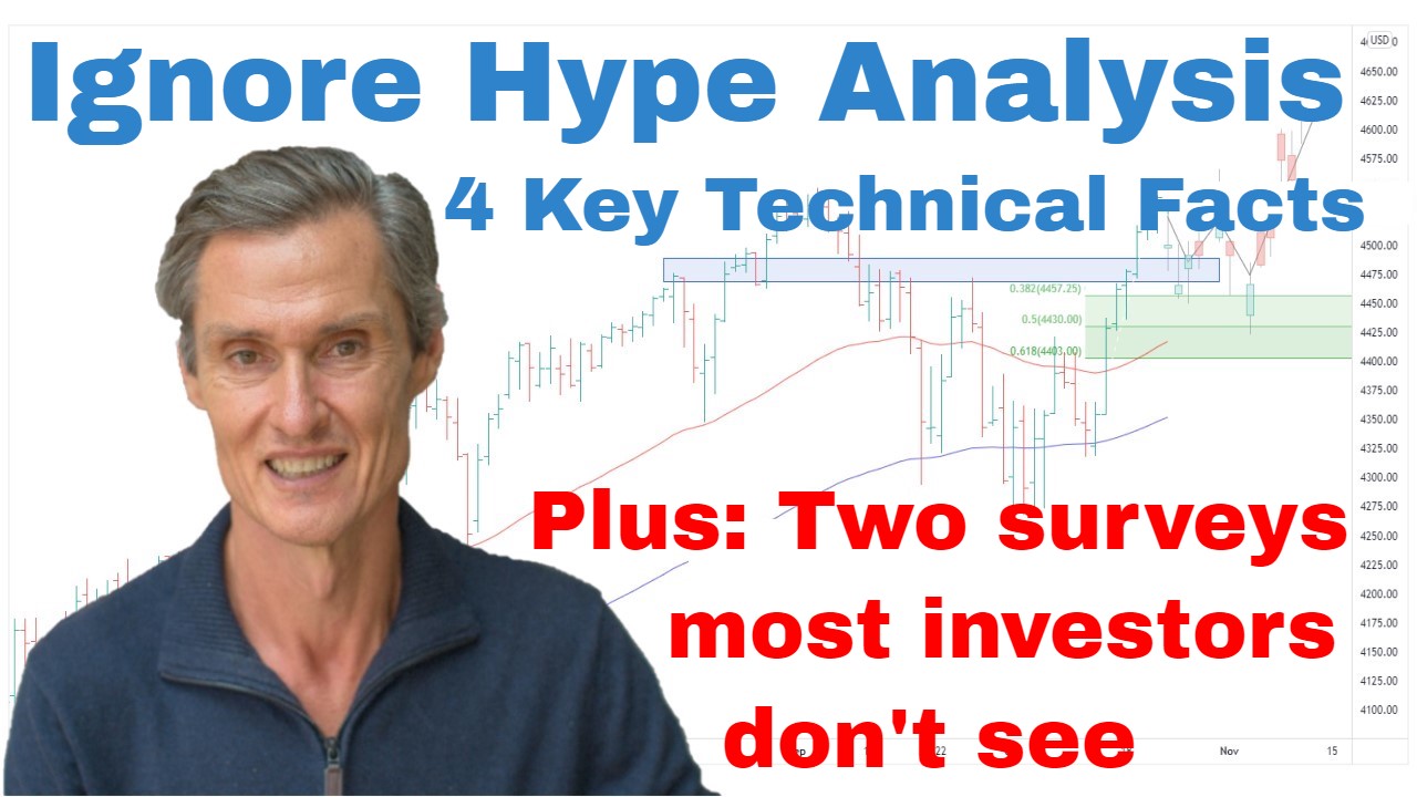
So, we have the S&P 500 up on the screen. And this is really starting to get interesting. So, since February, we’ve seen the S&P 500 consolidating in a fairly tight range. So, that in itself isn’t overly exciting, but what is interesting is that it’s been holding up here near a four-month high for…the longest period it’s actually held near a four-month high since…you need to go back to 2021 to see the market at a four-month high for such a lengthy period of time. Looking at these periods during 2002, it didn’t hold near highs for very long. And so that’s something different. That’s a very different tone to what we were seeing during last year where the rallies were all quickly sold.
Now what I want to do, I want to go over to a 60-minute chart and really zoom in on the price action over the last few weeks. And it is interesting when you break things down on a shorter-term basis because you can see that the markets had several sharp attempts to sell off. And on each occasion where we’ve had those sharp sell-offs, the markets quickly found support and rebounded. The latest of these sell-offs is the PPI release which came out on Thursday during the course of day session. And we also had the CPI earlier in the week.
Now what’s interesting is that both numbers were a bit ahead of expectations, a little bit higher than expectation. CPI, the market quickly recovered from. PPI, we’ve seen this sell-off. So, what’s going to be interesting to see now is, can this decline from the higher-than-expected PPI, is it going to gain momentum, or is it going to be like these previous attempts to sell off where the market quickly recovered? So, that’s yet to be seen. This may take a little bit more time until we can get the answer. Maybe the Friday session in the U.S. is going to give us a few more answers, but it is going to be interesting to see how this latest decline is handled and taken on by the market.
I want to go over to the four-hourly chart and get a little bit more data. And just when we look at this on a four-hourly chart, we can actually compress this back up to the highs in January. And what I want to look at here, I want to look at a couple of these previous peaks. What we see on these occasions is that when the market started to pull back, it quickly got below the moving averages. And once it was below those moving averages, it was a case of selling the market every time it got up. And every time there was a rally, it was a sell-the-rally situation. What we’ve got now is different in that this time we’ve had a pullback to the moving averages and the market is finding support. And just in the last few weeks, it’s been a case of finding support and that dip being bought. So, this is a distinct change in market behavior than what we’ve seen over the past year.
And, for me, this is the market behavior that you can see in a chart. So, a chart can be really useful for trying to observe these often subtle shifts in how the price action and how the market is handling different situations. And it’s quite different to what’s occurred over the 2022 period. So, monitoring the next few days is going to be interesting. Are we going to see this latest dip being supported?
So, going back over to the daily chart. And so at this stage, the read on this chart, for me, is that the price action is favoring the bulls. It continues to do so. And the facts as they stand are the S&P 500 is above its 50 and 100-day moving averages. The moving averages are positive in that they are trending higher. The 50-day average is above the 100-day moving average. And that’s the hallmark of a market which is in an upward trend. And I think that when you look at the price structure like that, well, these are the underpinnings of a bullish setup. So, from my perspective, the path of least resistance, it remains to the upside. I think that’s where we continue to be. So, I think the play here remains approaching this from the long side. That’s been the case for several months now that the path of least resistance has been to the upside.
I think the people shorting the market at this current point are probably the same people who were shorting the market back in October, November, shorting in December, shorting in January. That hasn’t been playing out well. Maybe this time is different. Maybe shorting here in February is the play, but it is fighting the trend. People say that… They’ve been saying the whole way up that my suggestion that the market could rally has been fighting the Fed. What I’d say to them at the moment, as things stand, shorting the market is fighting the trend. Now, of course, the trend can change. That’s why we have risk management strategies. But at this point, trend or the path of least resistance does seem to be to the upside.
So, as I’ve been saying for a while now, I think it’s a case of seeing where this momentum takes us. Might take us much further, or it could continue to take us up towards the previous highs. We don’t know. Nobody knows. So, I think the play is see where the momentum takes us, and use those risk management strategy. If market turns, we have a way out, we have a turnaround point.
Now, if you’re getting some value from this, please hit that like button. Please leave a short comment, just “Hey, thanks for the video.” It just tells YouTube people are watching, people are engaging. YouTube goes out and shows more people, and that helps me heap. So, please do that. Also, hit the subscribe button if you haven’t already, and yeah, join me as a regular viewer.
Now, I just want to have a quick look at the bond market. This is the U.S. 10-year bond yield. I spoke about this briefly last week. I pointed out this wedging formation. It’s a bullish wedge. Downsloping wedge is a bullish formation, although we are looking at the yield and bonds, and so it’s a bearish formation, essentially, for the yields because it means yields going up. And that’s what we’ve seen through the week. We’ve seen yields start to start to climb. This is just something to keep an eye on, and it could lead into that scenario where stocks do continue to pause and trade sideways, continue to consolidate, maybe pull back over the next several weeks. It’s one of those things we just need to be aware of.
Now, I want to come back over to equities and look at the NASDAQ. Very similar story to the S&P 500 in that during February, we’re seeing the market work off that big rally we had during January. And we got to the point where the NASDAQ started to get quite stretched above these moving averages. And when that happens, we often get these pullbacks which we’re currently seeing. But I think the big four positives, there are four big positives for me on this chart when we look at the NASDAQ. Positive one, NASDAQ is above the moving averages. Positive two, the moving averages are positive as they are in the S&P 500. The 50-day average is above the 100-day average. The price is currently above a support region at around 12,000. And the fourth positive is we have this bullish reversal pattern, the downward-sloping bearish wedge which prices break out from in late January.
We’ve currently had an initial move out. We’re having a consolidation above the breakout point, which is, of course, quite a typical price action after a breakout from some sort of a trading range or a trading pattern, reversal pattern, whatever it may be. We often get these pauses after the breakout. And of course, none of this guarantees that the NASDAQ is going to keep rising or keep rallying. But the technical setup at the moment does favor more upside over the coming months. Maybe it’s a case that this market does continue to pause and consolidate, maybe it’s several weeks, maybe it’s longer.
But at this stage, the structure does support further advance, more consolidation, maybe. Maybe that fits in with what we’re seeing in the bond yield. Then I think we need to remain open to the possibility that this market continues to rise, find the expectations many that it needs to roll over and collapse. Could happen. Again, that’s what risk management strategy is for while we have exit stops on our positions. But if the market continues to rise, I want to be on that momentum. I want to play the momentum rather than be sitting on the sidelines or in the market actively shorting as the market is rising. That tends not to be a winning proposition.
The key to the near term, I think, is we want to see traders and investors stepping in and buying this dip. So far, that’s been happening. We’ll see whether that continues to play out over the coming week. And if we find that this pullback is supported around this 12,000 area, if it’s supported above the moving averages or around the moving averages, I think that does set up that potential launching pad for another test to the upside.
Now, I want to show you a couple of really interesting graphs that turned up on my Twitter feed through the week. So, this is the first one, and this is from the Bank of America, their Global Fund Manager Survey, and it’s recession fears from the fund managers. What I’ve found interesting in this is you look at these high points, March 2009, April 2020. Now, this was the bottom, the depths of the GFC. This was, of course, just after the bottom from the COVID crash. Now we have November 2022, last year, when bearishness was at its absolute height and there were so many calls that the market was going to collapse, that it was going to be another GFC-style decline. Of course, that didn’t happen. We’ve had the market rally.
Now got those recessionary fears coming up. There’s still plenty of people suggesting a recession is coming. Maybe it is. I’m not saying it’s not. But the fears of a recession are receding. So, when you ask, what could fuel this rally? What could fuel a continued upward move in the market? Rates are rising. There’s still a lot of macro and uncertainty. Why would the market rally? And one possibility is that things go from bad to less bad, less people expecting the worst, and that sees money move into equities. That’s just a possibility, but it’s interesting to see how these peaks have coincided with rallies in the market.
The other graph I want to show you is another interesting one, also from the Bank of America Global Fund Manager Survey. This is showing the percentage of fund managers calling this a bear market rally, so those thinking it’s a bear market rally. And this survey was done February 2023, so just now, just most recently done. And interesting that around two-thirds are saying this is a bear market rally, not the real thing. So, again, maybe it’s right. I’m not saying this isn’t a bear market rally, but I’m just saying be open-minded to the possibility that stocks could continue to rally. It could be a bear market rally, and we see another 10%, 15%, 20% of the market. We don’t know.
But it reminds me of a famous quote from a guy called Jesse Livermore, one of the great speculators of the 20th century. Jesse said that, “The stock market is never obvious and that it’s designed to fool most of the people, most of the time.” So, most of the people think it’s a bear market rally. Maybe they’re right, maybe they’re not. We don’t know. Only time will tell. But this is why I say follow the momentum, not the opinions, and use risk management strategies. It’s not about getting everything right. It’s about making money. I think the best way to make money is you go with the trend, go with the flow, you see where it takes you, and use risk management to get out when it’s wrong. And for me, that’s the best all-weather strategy that I know.
So, let’s leave it there for this week. Thanks for joining me. Hopefully, that was interesting. Hopefully, it was helpful. I look forward to coming back and talking to you next week. Until then, bye for now.
Please see video for more detailed analysis and charts
Looking for the best ASX stocks to buy now?
Motion Trader‘s algorithms scan more than 2,000 ASX stocks daily in search of medium term investment trends. We then tell our members precisely when to buy shares. And most importantly, we tell them when to sell.
Try a no obligation FREE 14-day trial of Motion Trader, and see what an algorithmic trading approach could do for you.
Meet Jason

I'm Jason McIntosh, the creator of Motion Trader. My career began in 1991 on the trading floor at Bankers Trust. Nowadays, I trade my own systems from home in Sydney.
Motion Trader is for investors who value robust analysis, data driven entry and exit signals, commentary, and education. I use engineered algorithms to identify when to buy and sell ASX stocks. No biases or guesswork, just data driven signals.