
The One Indicator Every Trader and Investor Needs

Okay, so I know you’re probably keen to hear about your special bonus.
What I have for you is unique… it’s a proprietary indicator that I developed myself, and it’s not available to the public. I use it to help identify when the market is nearing key highs and lows.
But first, let me tell you about my introduction to charts…
You see, it was in late 1991. And it was largely by chance.
I had a part-time job in the dealing room at Bankers Trust. I would go in every day after uni to do admin tasks. It was an ideal springboard to a graduate position.
Things went well. And by the end of the year I had two potential full-time offers. One was on the floor of the Sydney Futures Exchange, the other was in the charting department.
My first thoughts were of the futures floor. It was full of noise and activity. This made charts seem a bit dull. At 21 years of age, I didn’t know any better.
But fate had the casting vote. The head of charting was first to offer me a position. I wasn’t about to tell him I’d think about it. I took the job on the spot.
My new boss — Scotty — had the respect of all the top traders. They’d often stop by our office to discuss the markets. It was a learning experience like no other.
Scotty taught me to see the market in phases — up, down, and sideways. He said understanding the cycle was key. This is what makes successful trading possible.
My year with Scotty was a gift. It put my career on a path I couldn’t imagine. Many of the lessons from that time sit within Motion Trader’s algorithms. I also discuss them in my weekly mentoring reports.
Learning the rhythm
So this brings me to your special bonus…
While my trading is mostly algorithmic, I still look at the charts daily. This gives me valuable clues about the market’s next move. I can then use this information to adjust my trading capital.
Just think about this: Imagine investing more when the odds are favourable, and less when risk is increasing. This sort of knowledge could give you a real edge.
Check this out: 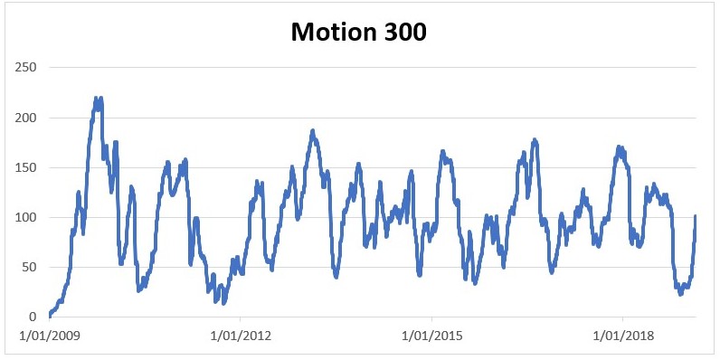 This is my proprietary indicator — I call it “Motion 300”.
Here’s how it works…
The indicator calculates the number of top 300 companies in a rising trend. The stocks change over time, but the number remains fixed at 300.
A stock enters an up-phase when its shares:
1. Hit a 40-day high; and
2. Are trading above their 100-day moving average (MA)
The trend stays bullish while the shares are above the MA.
If you don’t know, a MA is simply the average share price over a set period of time (in this case, 100 days). A rising MA is typically a bullish sign.
The indicator mostly ranges between 25 and 225: a low number indicates stocks are generally weak, while high numbers occur when the market has been in a rising trend.
I use this indicator to help identify key turning points. Major lows tend to occur when the indicator trades below 50, and then rebounds. While notable market tops usually appear above 150.
Okay, now have a look at this: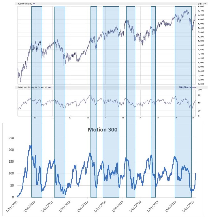
Let me explain what’s happening…
The image aligns the Motion 300 indicator with the All Ordinaries. It covers a period of a little over ten years — from January 2009 to February 2019.
Now, I want you to focus on the indicator first…
Notice how it rises and falls in an almost rhythmic fashion. The number of bullish stocks increases to above 150, then falls to below 50. This cycle repeats over and over.
You’ll see several shaded areas on the chart. They cover periods when the indicator peaks (above 150), to when it bottoms (below 50). This is when the number of bullish stocks are declining.
Now, follow those shaded areas up to the All Ordinaries. Pay close attention to what happens during those periods. You’ll see these typically coincide with a lull in performance.
The best time to make money is during the upswings. This is when an increasing number of stocks are breaking higher. There are also better prospects for strong trends to develop.
The opposite is true when the indicator is falling. These are times to consider reducing your market exposure. Knowing when to reduce risk could be a big advantage.
You see, the market is like many living organisms — it inhales and exhales. Understanding this cycle could give you an edge… it could put you ahead of those who rely on the daily news reports.
And if you join Motion Trader, you’ll have full access to this valuable indicator.
I’ll update the Motion 300 each week and put it on the website. This could help you gauge the market cycle like never before. You’ll know when to reduce risk and when to step-up.
I don’t offer the Motion 300 as a standalone service — the only way to get it is through a membership to Motion Trader. If I did sell it separately, the going rate would be $995.
But you’ll get it for FREE.
Imagine if you could reduce or increase your market exposure at the right times… imagine how much better your overall returns could potentially be.
Believe me, the Motion 300 could be the most valuable indicator you ever use.
Study the charts above carefully. They give you a rare insight into the market’s rhythm. There’s every chance they’ll be some of the most valuable pictures you ever see.
And if you’d like to come over and join me at Motion Trader, CLICK HERE
All the best,
P.S. Retail traders tend to get things back-to-front… they pile into stocks near market peaks and sell-out once the worst is over. But it doesn’t need to be this way. The Motion 300 gives you an insight to the market's cycle that few people see. It could be worth the price of Motion Trader on its own.
Click here to make the Motion 300 your own proprietary indicator
