Trade the Trend | Episode 21
By Jason McIntosh | Published 24 December 2021
Trade the Trend is a weekly video focusing on where the stock market is going. It’s for investors and traders looking for insights to the market’s next move. Jason uses technical analysis and trend following techniques to help you piece together the world’s biggest puzzle.
Where is the Stock Market Going?
00:00 Intro
00:17 Where is the S&P 500 going?
03:27 Where is the Nasdaq going?
04:09 How to draw Fibonacci retracements
07:46 Understanding price structure on a chart
10:58 Where is the Russell 2000 going?
12:15 Where is the ASX 200 going?
14:49 Why you should have a stop loss
Where to invest now?
Looking for ASX stocks to buy now, as well as off the radar ideas most people don’t know? Our algorithms scan the stock market daily for medium term investment trends. We then tell our members precisely when to buy shares. And most importantly, we tell them when to sell.
If you’re ready to get started, try a no obligation FREE 14-day trial of Motion Trader, and see what an algorithmic trading approach could do for you.
Transcript
Please note: Charts available from video
Welcome to this week’s edition of “Trade the Trend,” a weekly video discussing where the stock market is going. I’m Jason McIntosh. It is Christmas Eve, Friday the 24th Dec 2021. As always, this is a general commentary and doesn’t take your personal situation into account.
All right, with all that said, let’s jump over to the first chart. Okay, well, let’s see, S&P 500. And yeah, look, it’s been a pretty interesting week. We got some bearish feeling selling earlier in the week. Let me just see through here.
That was pretty much on Monday morning local time in the Sunday evening session in the U.S. And around then, around sort of like Monday, Tuesday, I started seeing, you know, some bearish concerns about the markets generally.
You know, this whole Omicron, sort of, fears were coming to the fore and people were concerned that maybe we’re going to see some more fire through selling, and that maybe we were going to get a bit of an ugly week. But look, that earlier weakness really didn’t amount to too much. And the U.S. markets opened on Monday night and have been trading higher ever since.
So it is interesting because the price action that were being seen through this section here really didn’t support the notion that we were going to get a big sell-off just at this point. I’ll come back and talk a bit more about that in a moment because it is interesting to sort of, like, look through the price structure for trying to understand where markets might be going.
But like on this chart, so at the moment, look, what appears to be happening here, it looks like maybe we’re getting a triangle formation developing on the charts.
So let’s just draw that in. And now what I want to do… So look, so we had this big run-up from the October lows and the consolidation they’ve been having. And for these patterns to form, it takes a bit of price action. It takes a little while for the picture to start to firm up. But this is the way it’s now appearing. It does look like we’ve got that pattern.
So I want to jump over to the four-hourly chart. You’ve probably now been watching these for a while. I like these four-hourlies and hourly charts. It just gives you more internal structure to the price action and can help you see these patterns better, and can give you better ideas of how it’s all shaping up. So, look, the way this could play out…
So getting up towards the upper bounds of this triangle, we’re coming into the Christmas and New Year week where trading is likely to be…well, trading will be probably light. And you know, it could stall, could very well stall up around here for the next few days.
So it’s possible, you know, we see the market just sort of, like, chop around. But look, I’ve got to say the odds favor that after that, that we do get a break to the top side. Look, I think our base case at this stage has to be that the bulls remain in control of the market. And the odds favor that we are going to see higher levels. I think that’s going to be the case.
So let’s jump over and check out the NASDAQ. So we just go back over to daily to start with and get our NASDAQ chart. Okay, so NASDAQ is interesting as well. So I want to start by putting on the…put the Fibonaccis on.
These are always a good way to, sort of, look at how the market is performing when you’re having, like, a consolidation or a pullback period. And we can see that that bounce from last week came pretty much right on the 50% retracement, and will kick straight back up to just below these previous highs.
I had a question last week, I was asked, “How do you work out where to measure your Fibonaccis from?” It’s like, I’ve been doing this for so long, it’s just second nature where to do it from. But I can completely understand that you may be watching this, go, “Well, why those points?” So what I’ve done for this one here, I’m using the low here and I’m using the high here.
So the Fibonaccis often tie in with Elliott Wave. Elliott Wave theory use Fibonaccis a lot in the Elliott Wave. I’m not really using it in Elliott Wave format, but I have studied it a lot previously, so it just sort of comes naturally where to put them.
So the idea is that with these Fibonaccis, you’re measuring what appears to be a complete move. And so, for instance, you are…so to me, this looks like, you know, yeah, a strong move that started here, finished there. So, you can also measure intervals within a move.
So, for instance, we could measure from here to here, like that looked like one interval within this larger move up. And you can see, it actually worked quite well, it came back to the 61.8%. Then you could say from this point here to this point, that looks like, you know, a complete internal move within this larger upward move. In this case, you can see it’s a bit hard to see with the other one there but didn’t quite come back to be 38.2%.
What you don’t want to do when you’re doing Fibonaccis is you don’t want to be sort of, like, measuring partial moves. So like, you know, starting it from here and then going up to there wouldn’t make as much sense. Yeah, it just doesn’t quite work. You’re meant to be doing it on completed moves, not partial moves. Look, you can do it on…
Just to give you an idea…like, I could do a whole video on this. I don’t want to stay too long here because it’s a lot to get your head around. Like, for instance, so this Section 3 here, like you could say, you do your Fibonacci from this point through to this point. That could be a whole move. But I would see…I see that as a zigzag correction, and then I’d say the new up move started from this point.
So then I’d measure from there. Not engaging, there we go. Measure from there to there. And then that worked, that picked up the low before we go to rally. So look, it’s one of those things which isn’t an exact science. It’s very much open to interpretation, but once you develop your chart eye and you develop a feel for these things, they can be very useful in working out pullbacks and consolidations.
Okay, so we got a little bit sidetracked there, but look, it’s an interesting thing to look at. And I will talk more about this in another day.
So, okay. So let’s jump over to the four-hourly chart, just a little bit more detail on this. Okay. So, let’s take our Fibonaccis off. I said I was going to talk about how the structure, the internal structure didn’t look like we’re going to get like a big sell-off this week. And I’ll tell you what I meant by that. I’ll look at this move up through here. Look at this move from the low to the high.
I see this as very much an impulsive structure. And by impulsive I mean that the up moves are strong and the consolidations are basically sideways. And there’s not much overlapping, internal overlapping between the up moves and the consolidations.
So, for example…let’s just get rid of that. For example, say this pullback, we had a pullback there, and it didn’t come back and it didn’t overlap with that high there. And, you know, there is overlap sort of through here but, you know, this all part of it. There’s always different ways you can explain that. But generally, you’ve got this impulsive move where the pullbacks are relatively shallow and it pushes high up.
Here’s quite different. Here is quite overlapped. So we had this move down, which looked fairly impulsive and it could have been setting up for something which could have turned into a larger decline. Then we had this strong move here. And what this move here does, it then overlaps with all this price action through here.
So the whole down move loses its momentum. Then we had another sell-off. The sell-offs are sharp, but they’re quite jerky. And then we had another strong rally. So we’ve got more overlap.
So this whole move then starts to become very overlapped and very corrective-looking. So, you get impulsive moves, you get corrective moves. A bear market or a larger decline is less likely to come from a choppy overlap move like this. This is more likely to be a consolidation before a market moves higher. So that’s just a little bit of…yeah, just a little bit of how these markets can shape up.
So, just looking at what we’ve got on the NASDAQ now. We’ve come back up to resistance, around here. Coincides with the top of the triangle and the S&P we were looking at a moment ago.
So look, the next few days, this resistance is, I think the odds would favor is going to hold the market. Maybe we’re going to see some…just a little bit of consolidation beneath it. But again, I think the odds favor that that’s what we’re going to get, that we are going to get a punch off above that resistance point.
Where to from there? Well, I don’t know. I think there’s definitely warning flags with this market, which we spoke about last week. The number of stocks above the 200-day moving average has been weakening. There’s divergence between some of the markets like the Dow is a bit further from its highs, whereas the S&P is close to it.
There are some warning flags in this market. But rather than trying to pick a top, I think the strategy is go with the trend. The trend at this point is up and we just need to see where the bulls are going to take this market.
Just briefly, very briefly on the Russell 2000. Last week we were talking about how the market had come back to support, which is located roughly right about here. And we talked about, with everything else we were putting together, all the pieces we were putting together, it didn’t look like it was going to have the momentum to punch through the support. And we said that a bounce was the most likely outcome. And look, that’s very much what we’ve had. We’ve had a bounce off this.
I don’t know what happens from here. We’re just going to have to wait and see. Look, if that pattern in the S&P continues to take shape and the NASDAQ punches to a new high, we’re probably going to see the Russell move higher as well. It’s very much in the middle of a trading range now.
So, it’s a matter of just wait and see what happens, whether it forms a base to have another launch higher. We’ve just got to wait and see. We need more information there. But, look, it has done what we thought last week. It’s bounced off support. It’s neutralized any bearish sort of scenario that was building for near-term breakdown. And let’s see where that goes over the next couple of weeks.
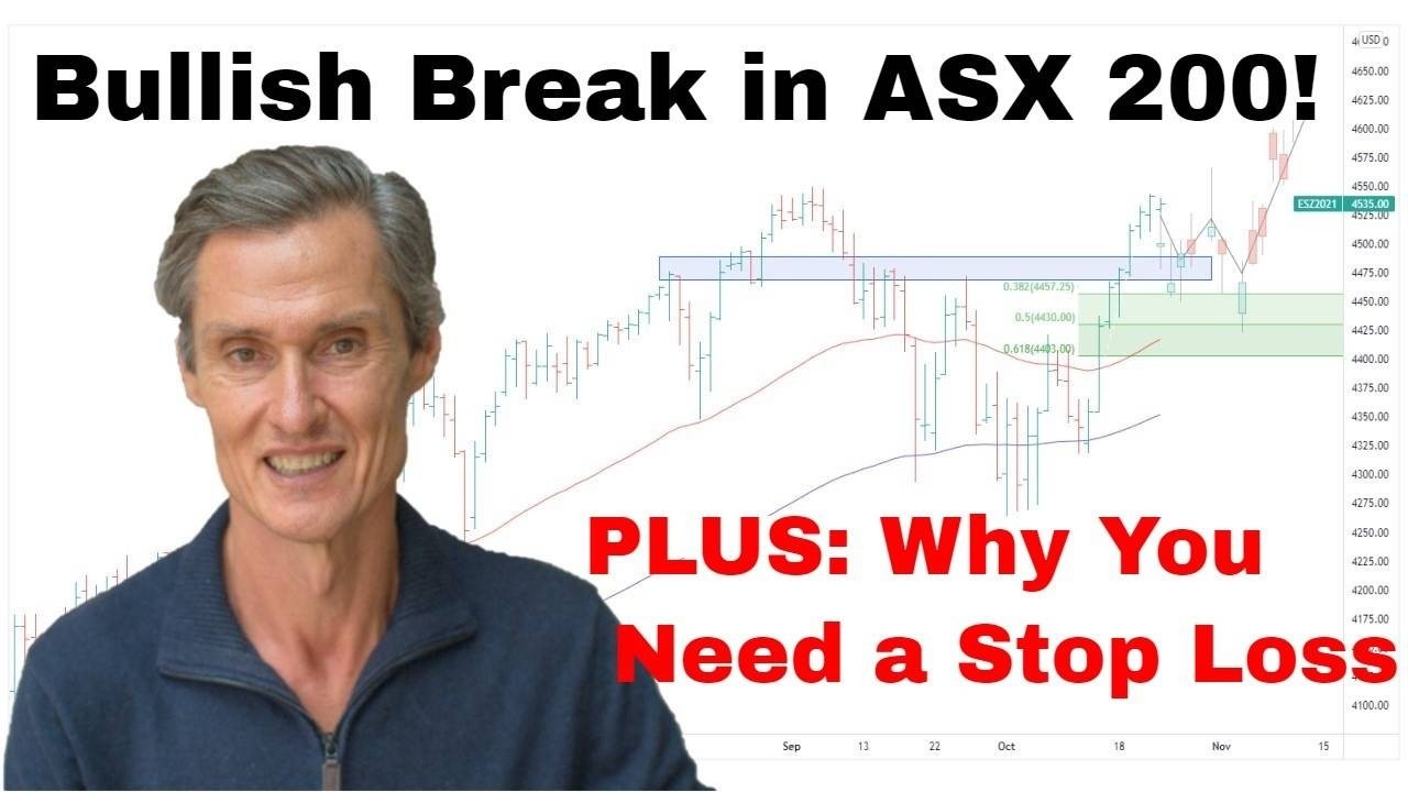
So, just jumping over to the Aussie market, looking at the S&P 200. Okay, let me just jump back to our daily chart to start this off. And last week we were talking about this triangle, which is really becoming, really, a clearly defined pattern.
It’s really interesting. And it’s been an interesting week because, despite some of the nervousness which are being observed in the market, you can see how well the ASX 200 is held up.
It’s actually broken to the top side of this pattern. And we were talking last week how it was…talking about how like the textbook, the textbook-type triangle would form like we talked about. It’s got five components to it which we count through letters. And this is again, it morphs back to this Elliott Wave theory. So we’ve got the A, the B, the C, the D, the E.
This is kind of where we left it last week and we said if it’s textbook, it would stop there and it would rally towards sort of the resistance. And that’s what it’s done. So, if it’s going to keep going textbook, which who knows whether it does because if everything was textbook you wouldn’t have too much trouble making money. But everything isn’t textbook, but it’s just trying to work around theory, and managing risk, and spotting possibilities, and applying strategies.
So if this were to play out, you know, you might get some sort of consolidation or return move there just above the breakout point before another rally. And maybe that will take the ASX 200 to a new all-time high. At this stage, I would say the odds favor that that is what’s going to happen, that we will see a new high in the ASX 200 in possibly January. So, interesting, let’s wait and see what happens.
Now, I’ve got one more chart I want to show you. And oh, by the way, if you’re enjoying this and you’re getting some value, please hit the like button as always and please leave a comment. Just a short one is good because it tells YouTube that people are engaging and that helps me.
So, that’d be great if you could do that. Just, you know, “Thanks for the video,” all you need to do. Or say more if you’d like to tell me more. That would be good as well. And also, if you haven’t, hit the subscribe button with the bell icon so you get the notifications.
All right, okay. last chart for the year. So this is a stock from my Motion Trader subscription service. And this is one the system got wrong, and, you know, it gets things wrong. You know, that’s just how trading works. But like, so let me just take you through this. So it’s a stock called Magellan Financial Group. It appeared in the news this week.
As you can see here, it had a big down, they had a 30% down day. It’s a big ASX 200 stock, a lot of people follow it, and it got hit really hard on some negative news.
So just winding the clock back, so here, these are the moving averages I watched, 50 and the 100-day. So we had the moving average crossed over and looked like after a period of declining prices, some base building, we start to turn higher.
The conditions were ripe for a potential upward trend to start. Not every upward trend will kick on and become a strong trend, but it’s all about looking for possibilities and then managing risk around those. So it triggered a buy signal, but look, this one petered out pretty quickly, it lost momentum, started to roll over.
All of the stocks which I follow will have an exit stop. So everything Motion Trader, my service, will find a buy signal for will have an exit stop. And so Magellan came back and hit the exit stop. The idea is to give it plenty of room to move around to try and engage an upward trend, but if it’s not engaging, you get out of the position. Walk away, minimize your loss, apply your capital elsewhere.
A lot of people don’t like to do that. A lot of people like to persist. And they say, “I don’t like red, I don’t like getting out at a loss. I won’t sell.” And I hear this all the time. And people tell me, they say, “I won’t subscribe to your service because you take losses. I don’t like losses. I like to hold.”
Look, there’s all sorts of ways to trade the market, but I think holding a falling stock after a particular point is dangerous because it’s not the ones that get to here and then come back that cause you the trouble, it’s the ones that get to here and they continue down and then they accelerate lower.
They’re the ones that can ruin your portfolio and be a deadweight within your portfolio for…it could be months, it could be years, it could be permanent.
Like, who knows where Magellan goes from here? Some stocks go to zero. It’s not a prediction for this company by any means, but we just don’t know. And that’s the point. You don’t know where a stock’s going to go, so you’ve got to have an exit strategy to protect your capital so you then can reallocate it elsewhere.
And the other side to this is that people who like to buy the dip. Buying the dip is…look, it can be a great strategy, but I think if you’re going to buy the dip you really got to understand the overall price structure of a chart.
You’ve got to be good at understanding, you know, the nature of a move. Like we spoke about earlier, understanding the structure of the NASDAQ, how we had an impulsive move, then we had an overlap, corrective, consolidated-look move.
So, if you’re going to buy the dip, you buy a move that looks corrective and like it’s consolidating that is overlapping. You don’t buy a move like this, which starts looking impulsive to the downside where it’s gathering steam. That’s just putting yourself in front of a steamroller and you’re destined to get run over at some point, and that’s not what you want.
So, look, I think, buying the dip’s a dangerous strategy, but if you’re buying consolidations like we were speaking about before, you can use the Fibonaccis for, like, points like, you know, the 38%, the 50%, the 61.8%. But look, if you’re not comfortable with that, if you’re not confident with that, and if you’re in doubt, I think the way is, you know, you look, here’s your moving averages and you buy stuff which is going up. On this occasion, it hasn’t gone up, but look, lots of the time stocks do.
So we just, you know, wind this back a bit. And like here, here’s another buy signal I had in Magellan a while ago, it was 2019. Moving averages turned, the stock was gaining momentum, and this ran for a long way.
Ran for a long way until it eventually hit the trailing stop. So, it’s like, you know, you let your winners run and you cut your losses relatively early. That’s how I do it, and that’s how a lot of the really successful traders and investors operate their portfolios.
All right, well, look, that’s a wrap for this year. I’m going to take a break next week. I’m going to take a week away from it all, then I’ll be back with another video in two weeks’ time. So, thanks for joining in. Thanks for being part of “Trade the Trend” this year. Have a good break yourself and look forward to speaking to you again soon. Bye for now.
Meet Jason

I'm Jason McIntosh, the creator of Motion Trader. My career began in 1991 on the trading floor at Bankers Trust. Nowadays, I trade my own systems from home in Sydney.
Motion Trader is for investors who value robust analysis, data driven entry and exit signals, commentary, and education. I use engineered algorithms to identify when to buy and sell ASX stocks. No biases or guesswork, just data driven signals.