Trade the Trend | Episode 20
By Jason McIntosh | Published 17 December 2021
Trade the Trend is a weekly video focusing on where the stock market is going. It’s for investors and traders looking for insights to the market’s next move. Jason uses technical analysis and trend following techniques to help you piece together the world’s biggest puzzle.
Where is the Stock Market Going?
00:00 Intro
00:17 Where is the S&P 500 going?
03:45 Is market breath weakening?
09:34 Where is the Nasdaq going?
14:08 Where is the Russell 2000 going?
15:38 Where is the ASX 200 going?
19:38 Should I buy Chinese stocks?
Where to invest now?
Looking for ASX stocks to buy now, as well as off the radar ideas most people don’t know? Our algorithms scan the stock market daily for medium term investment trends. We then tell our members precisely when to buy shares. And most importantly, we tell them when to sell.
If you’re ready to get started, try a no obligation FREE 14-day trial of Motion Trader, and see what an algorithmic trading approach could do for you.
Transcript
Please note: Charts available from video
Welcome to this week’s edition of “Trade the Trend,” a weekly video discussing where the stock market is going. I’m Jason McIntosh. It is Friday, the 17th December 2021. As always, this is a general commentary and doesn’t take your personal situation into account.
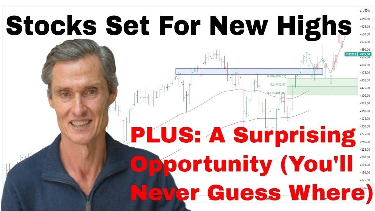
All right. With that said, let’s jump over to our first chart, the S&P 500. Well, it has been another interesting week. We had the U.S. Federal Reserve meet during the week. And they confirmed that there’s really a series of rate hikes along the way.
And they also confirmed that they’re planning on continuing to wind back their stimulus program, which has been so prominently pushing the market over the last year or so.
And it’s… Look, the way the market reacted was really interesting. The market had… I’m going to zoom in on this area in a sec. But the market had quite a positive reaction to it, as if the market said, “Well, look, this isn’t as bad as we thought.” And it’s continued to push higher.
So, let’s jump to a four-hourly chart. I like looking at these hourly and four-hourlies because you can really get to see the internal makeup of the market. It tells you a lot more than just looking at a day bar on its own.
So, this is the period where the Fed came out with their commentary on what they’re planning to do. And you can see the market had this really strong reaction to that.
Shot up higher, and it was right near the end of the trading session. And it actually, like, ticked up and made a new all-time high. Now it’s pulled back over the last day or so.
It’s interesting when we look at this. So, I want to look at the move off that low we had early in December, up through to the high just prior to the Fed meeting, and we put the Fibonaccis on it. Fibonacci is always interesting to look at because they give you ideas where markets can pull back to when they do have their pullbacks and consolidations.
And in this case, we can see, look, it came right back to that 50% sort of region. And look, it’s just classic of how these markets often operate. And then it’s from that 50% retracement that we had the strong, strong rally higher. Look, I’ve got to say that it really does appear that this market wants to go up and break to new all-time highs.
We did have that shortly break up here, but the market seems to pull back. But I think there’s every chance now that we’re going to see the market maybe consolidate a touch more around here, but then have another crack at making a new high. So, look, we could see this sort of price action develop over the next few sessions.
Maybe it’s a little bit more sort of work around, but then it does kick higher. That’s what the price action currently gives a feel that it’s going to do. And I think unless we see this level from a few days ago break, I think we do need to give the bull the benefit of the doubt. And yeah, I think the likelihood does favor those new all-time highs in the near term.
So, look, that said, I do maintain a cautious stance towards this market. You’ve probably heard me talking about this over the last few weeks, maybe even a bit longer, that there are…look, there are some flags to be aware of in the market, notwithstanding the bullish trend remains intact. So, let’s just clean this up. And I want to show you what I mean.
So, for this, I’m going to jump over to a daily chart. Don’t need all that inner workings there, so we’ll get to the daily chart. I’m going to put on a study, which I think is really interesting to look at. So, it’s the S&P 500 stocks above their 200-day moving average. So, let’s select that. Okay. So, let me just get the proportions right, to sort of, like, work through what I want to have a look at here. So, move things around a touch.
And so what we’ve seen… So, let’s just get a bit more data even on that. So, we’ll get the lows. We’ll get the lows from the COVID period. So, just fit all that to the screen. So, what we saw, what we saw after the COVID period, of course, all the…just about every stock was below their 200-day moving average.
Since the low, we have this price here, so more and more stocks getting above their 200-day moving average, which you expect to see in a healthy bullish market.
That’s what happens, more and more stocks get above their 200-day moving average. What we’ve had since around April, so, since April, as we know, the market has continued to rally. But what we see on… So, this is the breadth. It’s called the breadth of the market, the number of stocks which are moving up or down with the market.
What we’ve had since April is the number of stocks which have been participating in this rally have been in decline. So, it’s fewer and fewer stocks which have been driving it higher. And the ones driving it higher have tended to be those big tech names. Of course, there’s some smaller stocks, there’s mid stocks in there which are rallying too, but it’s the big tech stocks which have been pushing the market.
So, we’ve had this declining breadth. That’s… Look, that’s a…looks a concern. It’s a concern which I’ve had for a while. We want to stay with a bullish trend, but we want to be aware of signs which suggests that maybe there’s some underlying weakness developing.
Now, I want to go back to some previous periods and just show you how this has worked in the past. So, let me just get the…set up the graph so it’s nice and…so it’s clear for us to see. So, we’ve got this period in here. So, this was back in 2017. So, we got a rising market, but then we look at the breadth of that market.
The breadth was deteriorating. Didn’t lead to anything dire on this occasion. We only had a modest pullback, and then this series of declining stocks. It bottomed and then started rising again, and continued upwards with the market.
So, declining breadth isn’t necessarily a sign that something dire is going to happen. Sometimes it’s quite benign. So, we’ll go back. And I’ve got some more examples of this to show you.
So, I’ve got another period in here. So, this is going back to 2014. So, this is a little bit different this time. And it’s actually the most similar example we have to what’s going on in the market in terms of the length of time that the decline in breadth was going on. So, you can see where the market was rising. And now, look at the decline in breadth.
So, that’s not dissimilar to what we’re currently seeing. And of course, this led into a period here which was quite unstable for several months, before the market finally did base and work through a longer consolidation, and then continued higher.
We’ve got other periods like this one in here, which, again, wasn’t much to worry about. It was a relatively shorter period, but rising market, declining breadth. Did result in a pullback, but it wasn’t anything of note. And I have one more to show you, which it just shows, again, why it’s so important to be aware of the markets, you know, the structure of the…how the market’s underlying structure is being put together, what’s driving the market this period through here.
So, this was leading into the GFC. So, we had a rising market, but the breadth was giving way. There were fewer and fewer stocks driving the market, led to quite a disastrous period. I don’t think we’re heading into that. I don’t think that’s on the horizon at this point in time.
But nonetheless, it gives you an idea of what can happen. Here we are back to today. So, this is back to our current market.
Look, one thing that is possible, it’s possible that this shakeout we’ve had in the market probably through here, we had this really big decline in breadth, and it has been bouncing back.
So, look, there is a case to be made that this period of divergence is ending, and maybe the breadth is turning up, and this won’t…that we’ll…this possibly that that negates this…diffuses this pattern, and we go back into a period of stocks rising, and getting above their 200-day moving average. That’s quite possible.
So, it’s just one of those indicators we want to keep an eye on, and we don’t want to see this…we don’t want to see this continued decline, because at some stage, if this continues declining, the market is almost certainly going to give way to a larger consolidation. So, look, one of the flags, but let’s just watch that one.
So, now let’s jump over to the NASDAQ. So, the NASDAQ, the bullish trend is…look, the bullish trend in the NASDAQ remains in place. So, look at it from those lows back in 2020. And look, there’s nothing to tell you there that this trend is over and that it’s topping out. The trend remains in place.
There is a consolidation unfolding here, and we need to see where it’s going to…how it’s going to work its way through, but the underlying trend is, look, is clearly up. There’s not a topping pattern in place here.
So, let’s jump over to a four-hourly chart. Again, I want to have a look at the internal structure of this market, because that’s interesting on its own. So, look, when you look at the internals for this, it’s interesting to have a look at… Well, look, let’s first look at the Fibonaccis. So, we’ve got the…put the fib levels on there. And like the S&P 500, we’ve seen the market come back.
It’s really pretty much smack on to its 50% retracement, which is…it’s always interesting when it almost works out to the point, the reversal. And then we’ve had the strong rebound. We’re getting some more consolidation through here. But at this stage, you’ve got an impulsive rally and a corrective-looking period.
So, again, it’s one of those things that despite the concerns I have with the underlying breadth of the market, that I think you’ve got to give the bulls the benefit of the doubt. But what I also thought would be interesting to have a look at here is the structure of this advance.
So, there’s a theory called Elliot Wave theory. I studied this a lot during my…in the early ’90s, when I was just starting in the markets. And what it is, it talks about how the markets move in five-wave patterns. And there’s a really clear five-wave pattern here, so that’s why I just want to show it to you. So, you’ve got wave one, the pullback is wave two, you get a big wave three, pullback wave four, and then it tops in wave five.
Then often, you’ll hear me talking about ABC patterns. So, ABC is a zigzag correction. So, we’ve got the A, B, C. And now we’ve got the market looking like it’s going to start rallying again. It’s possible that you can move the B over to there, and we get a little bit more on the downside.
Maybe the zigzag comes back to there. But look, that’s your classic bullish picture. You got the five-wave advance and the zigzag correction.
I don’t use the Elliott Wave very much for what I do nowadays. It’s too hit-and-miss. It’s very, very discretionary. Two people can come up in completely different wave counts. But when it does stand out so clearly, yeah, it’s interesting. I thought I’d just show you there’s all sorts of different ways to analyze markets. And so, look, let’s just get rid of that.
Jump back to the daily. And look, as I say, I think we need to give this bull the benefit of the doubt. I’ll tell you about a mistake I made during the mid-1990s, around ’97, ’98, thereabouts. I was really focused on trying to pick tops, preempt the top of the market, and position ahead of a market turn.
And what I learned during that period was that it was better to give the trend the benefit of the doubt, and not try and pick those tops. It’s… Look, I think… I ended up being wrong by about 18 months.
There was a big correction. The dot-com bust basically hit, and it was a big correction, but I was wrong by 18 months. And if you’re out by 18 months, you’re basically wrong. It doesn’t matter that you had this big picture view which turned out right.
I missed 18 months of strong upside gain, so it was the wrong view. So, I’ve learned from that. Let the trend run its course, and use your trailing stops to get you out when the trend changes.
And if you’re interested to know more about trailing stops, you’ll find information about my Motion Trader subscription service below this video. Just click on the Show More button, and I’ve got a free training series which talks about trailing stops and how I set them, and giving stocks room to move, and I’ve also got a low-cost trial of my subscription service, which may be interesting.
Okay. Let’s look at the Russell, just briefly. Just only want to touch on this briefly today, because we’ve talked about this a lot in recent weeks. It’s come right back to a support zone, just through here. Come right back to support.
It looks like it’s a…it looks like it’s in need of a bounce. It looks like… I think it’s going to…given the structure of what I’m seeing in this S&P and the NASDAQ, I think it’s going to struggle to break through this, at least on its first attempt.
I think we’re going to see a rebound. I think maybe we’re going to see, you know, maybe something like that start to develop. And then, how that unfolds, that will give us some more clues to what’s going on in this market. This is another one of those breadth warnings, because it’s 2000 stocks in the Russell. They’re smaller cap stocks, and, you know, a lot of them are hitting 52-week lows.
So, it’s another one of those clouds, I think you could say, over the market. And we want to see this clear up before we could say, “Look, we’re really confident the market is going to continue to push higher.” But for now, I think the downside is probably limited over the next couple of weeks.
I think it needs a rebound. And that could be whilst the S&P and the NASDAQ, maybe they make new highs. We’ll see how this plays out over the next couple of weeks.
And, okay. So, let’s go and look at the All Ordinaries, so the ASX 200. So, this continues to shape up in a very interesting manner. We’ve got this big triangle formation. And as I told you last week, these triangles are one of my favorite patterns because they’re often a reliable pattern in that when you get a break from them, you can get some…you get some really good moves.
And this is really starting to coil up nicely. At the moment, you’d say this is a textbook triangle pattern. So, triangles often work in…there’s five waves to a triangle. And what you often find, you get from the start, you get the A, B, C, D, and E. So, you can count them in alphabetical, like, and you get the five, five waves, and we use the letters to mark that out. And that’s what we’re getting so far.
Looks like we’re in the E wave. So, if this was to go to textbook, and lots of things don’t go to textbook, that’s why these things are… Yeah. There’s so much discretion in any form of analysis. And that’s often what… That’s why I use the algorithms to make my trading consistent.
But look, I still like to try and analyze these patterns. And what you would expect from this pattern is that once this E wave’s finished forming, we get a break to the top side, probably get some sort of return move, and then you get the continuation of the rally.
Well, that’s how the All Ords is currently shaping up when I just look at this in isolation. Let’s not worry about the breadth of the market, what the Russell is doing, all that stuff. If we just look at this as a chart, that’s how this chart is shaping up.
So, look, what I’ve done, notwithstanding my concerns, I’ve lifted the hedging, which I told you I’ve had over the last couple of weeks. It’s… I don’t want to fight a bullish trend if the bullish trend is still in place, which it appears to be.
And we have a pattern, which it looks like it’s shaping up to be a continuation pattern, and potentially leading to higher prices. I’m not going to fight that. I’m not going to say, “I think the market needs to pull back more.” It doesn’t matter what I think. It is about what the market appears to be doing and what the possibilities are currently shaping up to be. And this looks like the highest probability possibility I’m currently seeing.
So, look, I think that’s the way… Well, that’s the why I’m positioning my portfolio. I’m staying long all my stocks. I’ve got my trailing stops in place, if this happens to top out here and start to lose momentum and turn to the downside. But while that bigger-picture trend is in place, that’s what I’m doing. I’m staying with my longs.
I’m giving them room to move, and trying to maximize my upside from this trend. I’ve got stocks which are up, you know, 100, 200… I’ve got one stock which is up 500-odd percent. I’m not going to start selling them because I’ve got concerns about breadth, but I am going to have trailing stops in place to get me out should things turn over.
Okay. So, let’s look at an opportunity. And by the way, if you’re enjoying this video, if you’re getting some value, please hit that Like button. Really important. It tells YouTube that people like it, and then YouTube shows more people, and I keep making more videos. And also, leave me a comment, even if it’s just, “Hey, I liked the video. Thanks.” It’s another good sign that goes to YouTube, which really does help me.
All right. So, there’s an interesting opportunity on the make, which I’ve been watching for the last few weeks. And you’re probably not going to guess which one it is. It’s… You might be thinking, “Oh, is it gold? Is it copper? Is it uranium?” It’s not. It’s Chinese stocks. And that’s not very helpful. Okay. It’s Chinese stocks.
So, let’s jump over and have a look at those. And what we see here is really interesting. So, this is the Chinese A50 Index. So, I’m going to just scrunch this up for a moment, and draw some support on this chart. So, if you go further back, all the way over here.
So, there’s a support region on here, between around 15,000 and 14,500. Where is 14,500? It’s thereabouts. About there. Let’s say that’s it. Okay. Big support region. It’s been in place since back in 2015. Previous highs. So, it was resistance, broke above resistance, now that becomes support. So, once a resistance is broken, the resistance becomes support.
Gave the market support here, it’s given the market support here. Okay. So, let’s go out a little [inaudible 00:20:48]. Let’s get a little bit more detail. Now, just through here is interesting. There are a couple of interesting little chart patterns. Wonder whether you can see them. Test your chart eye, if you can just maybe pause the video and see if you can spot a couple of patterns through here.
So, here they are. We’ve got a little triangle pattern in here. So, we’ve got that triangle pattern there. And so the market broke out from the triangle, had a run, had a bit of a pullback. We’ve got a pattern in here. So, this is a bit of a bullish wedge formation. Not the cleanest wedge, but it is that wedging sort of formation. The market’s broken up from that.
What it looks like, it looks like we’ve had… Remember before, I spoke about the zigzag correction? You know, you’ve got your classic zigzag down there, big bullish run, zigzag correction, come back to support. And now we’ve got the market looking like it’s now starting to gain some momentum and rebound off that support. So, that’s really interesting.
So, what I want to do here, I’m going to jump to the four-hourly again. Let’s get some little bit more detail on this section. So, let’s jump to the four-hourly chart. And what we have, we’ve got the breakout of this wedge up to a high. I think that might have been earlier in the week. And now we’re getting the pullback. So, Fibonaccis.
Fibonaccis are very interesting to draw in this sort of situation. And here we are. Very interesting. Just broken below the 50%, but we’re still above the 61.8%. So we’re still in the Fibonacci retrace pocket. So, this is interesting what happens here. How do you play this sort of scenario? Well, some people would say, “Okay, I’m going to buy the dip,” and then buy it here.
Problem with doing that is, like, what if this pattern fails? What if this market continues just to peel away, and just comes back down here? That could happen. So, that’s why I don’t want to buy the dip, because I don’t know where the dip is going to finish dipping. So, that’s not my play. My play is I want to buy on the strength.
So, I’m going to look at a previous high. I’m going to pick this recent high there. And if I were playing this, and I’m not going to play this. I’ve got capital allocated elsewhere, so I probably won’t get to this one. But if I were playing this, I’d say, “Look, if this market can break above this previous high, maybe we look for price action, you know, like that.” If it can break above that high, well, then that could be a point to say, “Okay.
Well, this is now regaining its upward momentum, and maybe this move is on to the upside.” And if it doesn’t break that point, well, no damage done, you don’t get in. So, that’s a risk management strategy.
So, let’s jump back to the daily, just briefly. And, yeah. So, look. This is a sort of pattern… I’m just going to tidy this up a little bit. Sort of pattern that when you look at it like this, it’s a sort of pattern where you could come back to in six months’ time and see this general sort of, like, upward move develop.
It probably wouldn’t be as clean as that, but, yeah. It’s a sort of, you know, we’ve got this rounding turnaround, and then move back up, move back to new all-time highs.
And so, look, I think that’s a possibility. I think it’s a good probability possibility as well, so it’s an interesting one. And if you’re interested in this, don’t worry. You don’t need to go to the Chinese market to play this. So, the Chinese A50, it’s the 50 largest mainland Chinese stocks. And there’s an ETF on the ASX. It’s called the VanEck A50 ETF. The ticker code is CETF.
And that gives exposure to pretty much what you’re seeing on this chart. So, look, it’s an interesting idea. For anyone interested in ETFs, maybe go and check that out, and see whether that’s to your liking.
Okay. Well, that’s a wrap for this week. Please hit that Like button. Let YouTube know you liked it if, of course, you did. And I look forward to coming back and let’s do it all again next week. Until then, thanks for joining me.
Meet Jason

I'm Jason McIntosh, the creator of Motion Trader. My career began in 1991 on the trading floor at Bankers Trust. Nowadays, I trade my own systems from home in Sydney.
Motion Trader is for investors who value robust analysis, data driven entry and exit signals, commentary, and education. I use engineered algorithms to identify when to buy and sell ASX stocks. No biases or guesswork, just data driven signals.